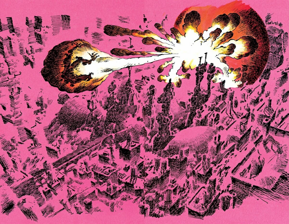
Lynn Varley was the first superstar comic book colorist, setting a standard for color work in an industry that wasn’t ready for her — and changing the way that audiences looked at comic book color along the way.
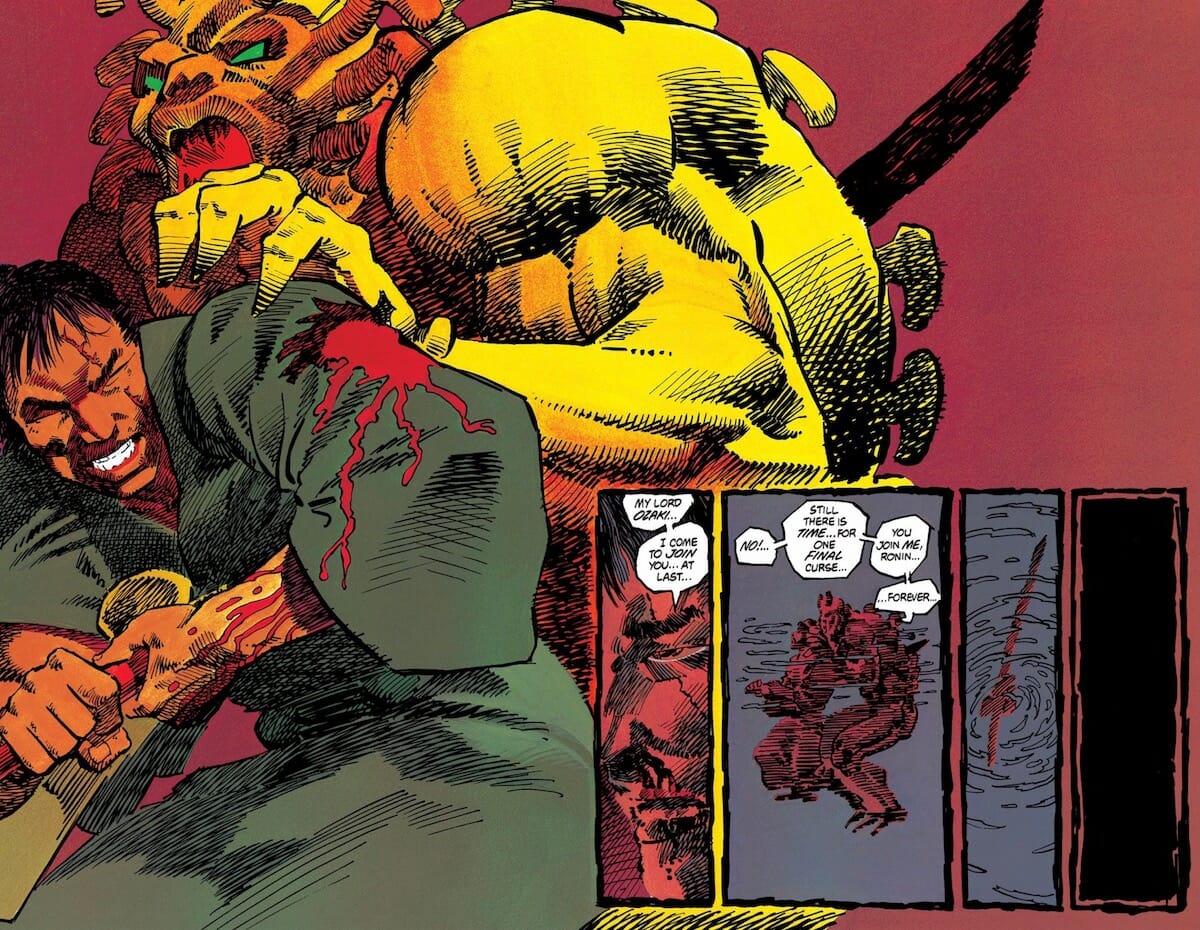
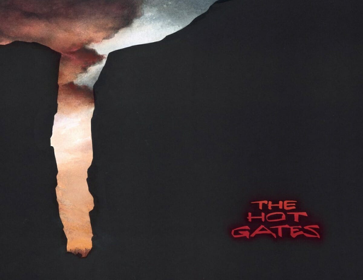
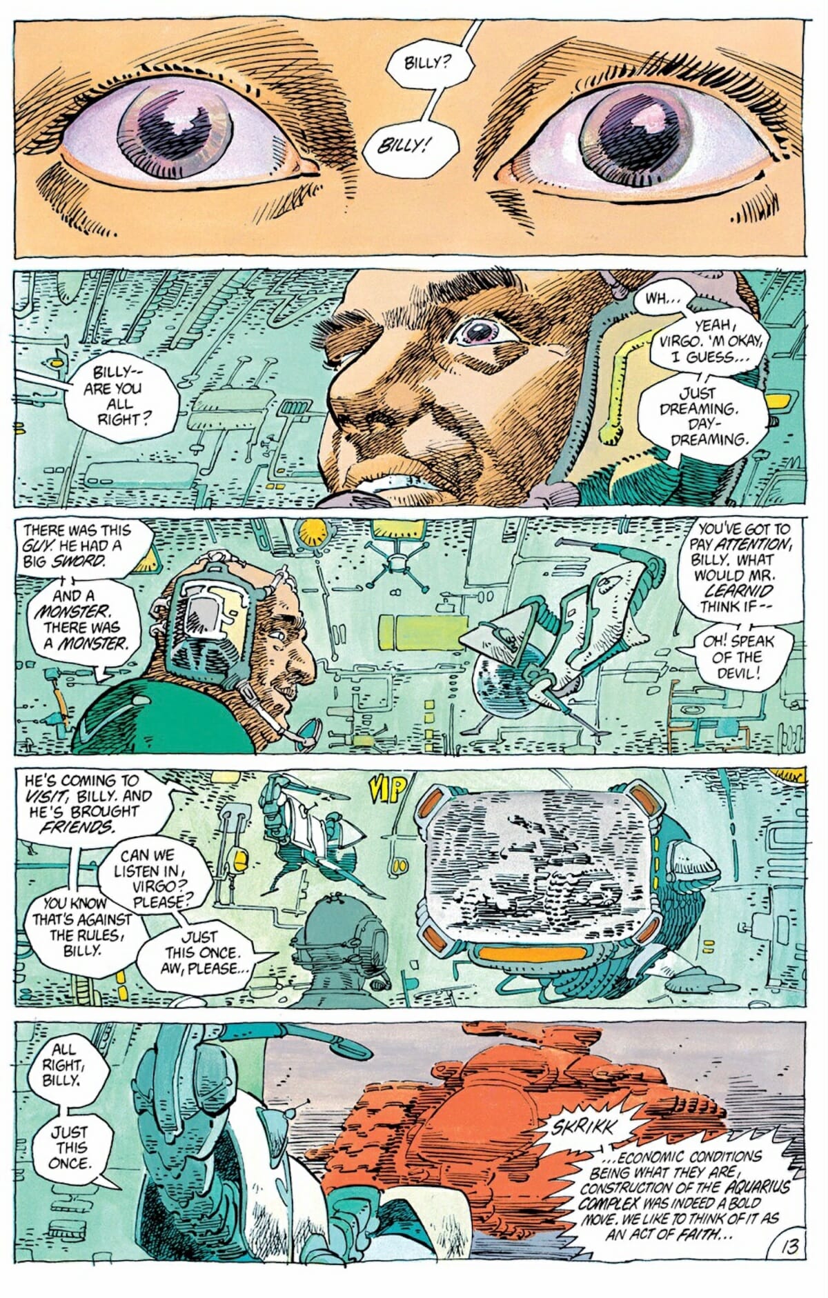
Although her first credited work came in 1982’s Batman Annual #8, it wasn’t until 1984’s Ronin miniseries by Frank Miller that Varley’s work first started drawing significant attention. Mirroring the boldness of Miller’s experimental samurai sci-fi tale, Varley’s watercolor work on the series was more subtle than contemporary peers in the U.S. comics market, combining the color palette of European comics of the era with an approach that switches between naturalism and the dynamism of pop-art comics at their best — something that demonstrated Varley as a standalone talent, but only hinted at what was coming next.
(Ronin wasn’t Varley’s first collaboration with Miller; that came a couple of years earlier, on the final issue of the acclaimed Wolverine mini-series Miller created with Chris Claremont, although her colors there went through the traditional separations process, and therefore were more simple in order to be reproduced easily by printers.)
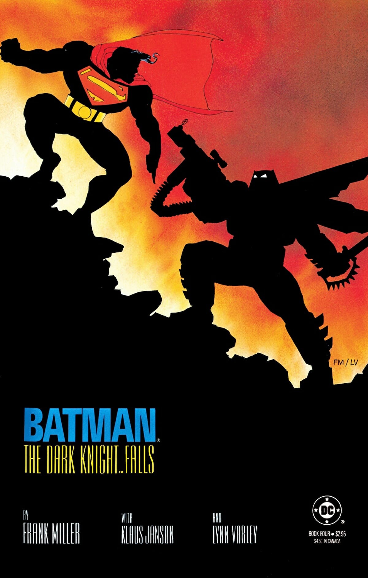
Although Varley continued her ongoing assignments in the wake of Ronin’s initial release — assignments that included the early issues of Howard Chaykin’s American Flagg series for First Comics, as well as issues of Daredevil and World’s Finest Comics, and a beautiful painting over Jim Aparo artwork for a Batman and the Outsiders cover — her next major project was one familiar to nearly every comic reader in the U.S., and another collaboration with Frank Miller: Batman: The Dark Knight Returns.
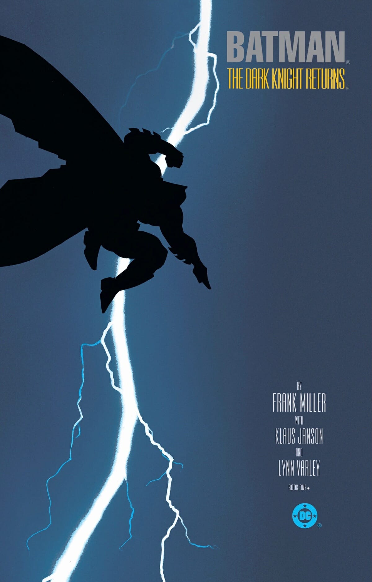
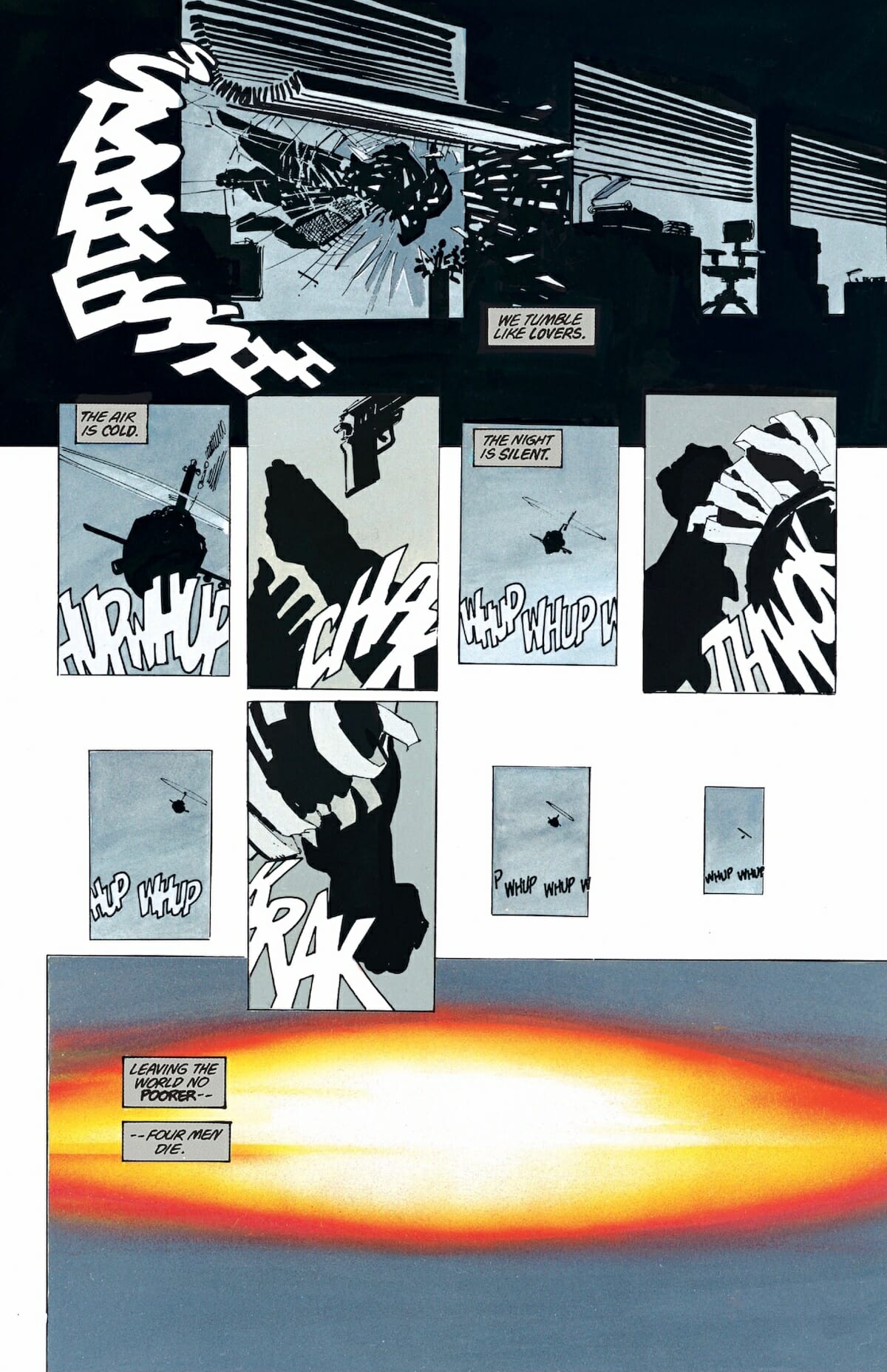
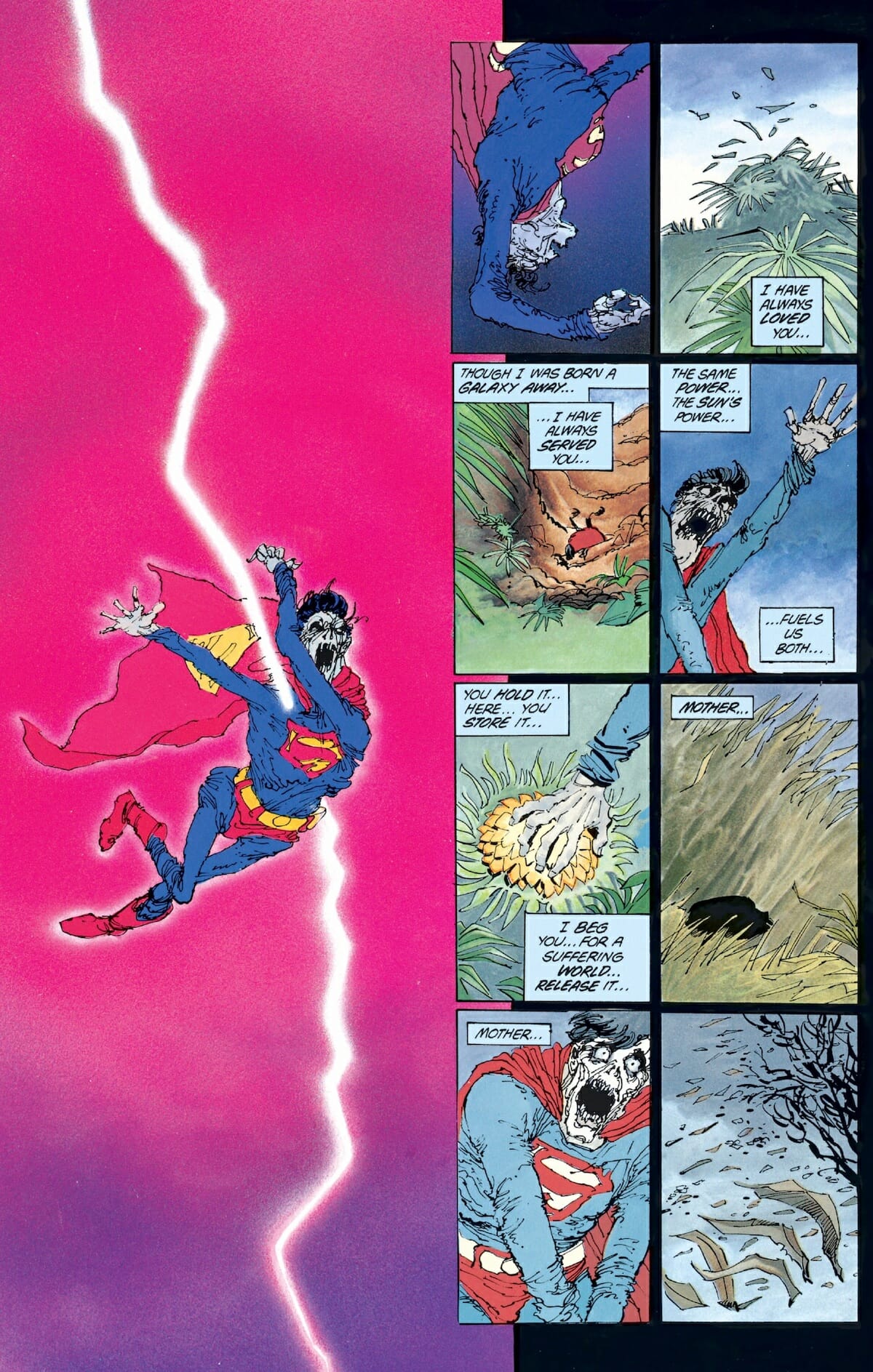
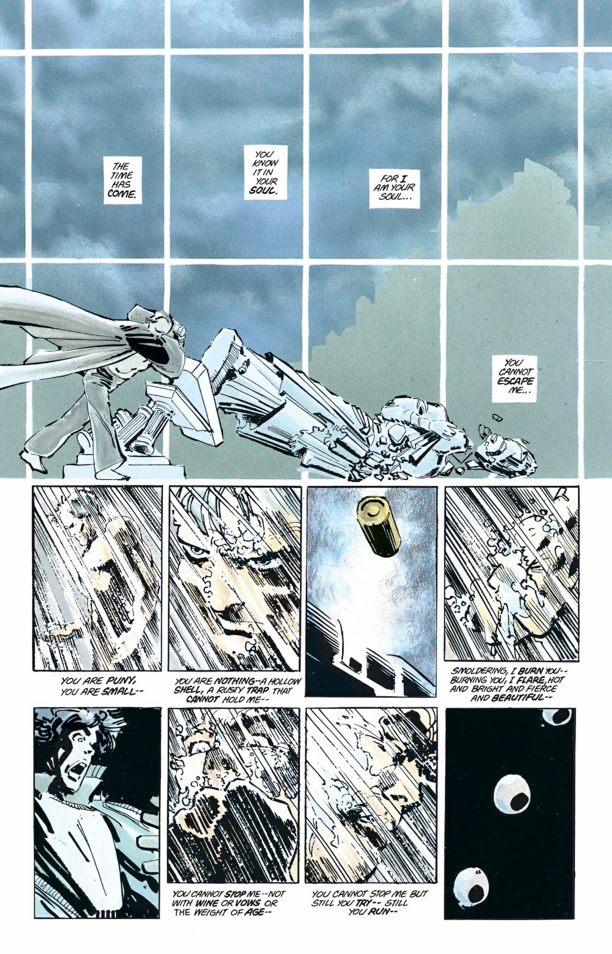
It’s fair to call Varley’s color work on Dark Knight iconic. Certainly, her colors define the visuals for the book — try to imagine the cover for the first issue, with Batman silhouetted against a lightning bolt in the night sky without the colors, and it’s clear how much she brought to the series. Once again working in watercolors, her contribution to the series is a masterclass in color, contributing at least as much (if not more) to the overall atmosphere and tone of the reading experience as Miller and Janson.
Note the way that she gradually amps up the colors as the more super heroic elements of the story re-emerge, as if the primary, primitive color palette from “traditional” comic books is returning to the real world — it’s astonishingly smart, subtle stuff that speaks to Varley’s ability to understand the story she’s working on and translate that into her work in a way that few colorists in the U.S. had managed to that point.
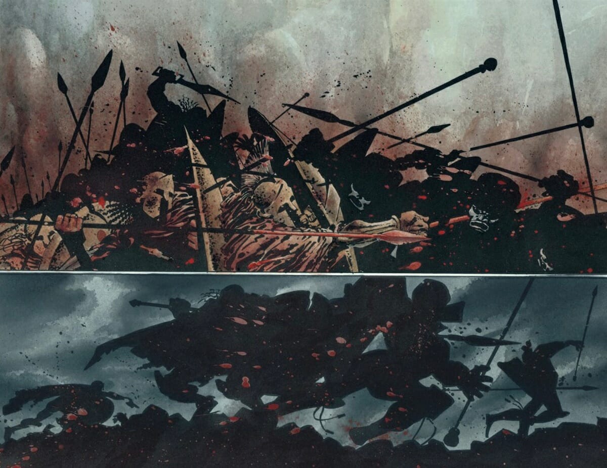
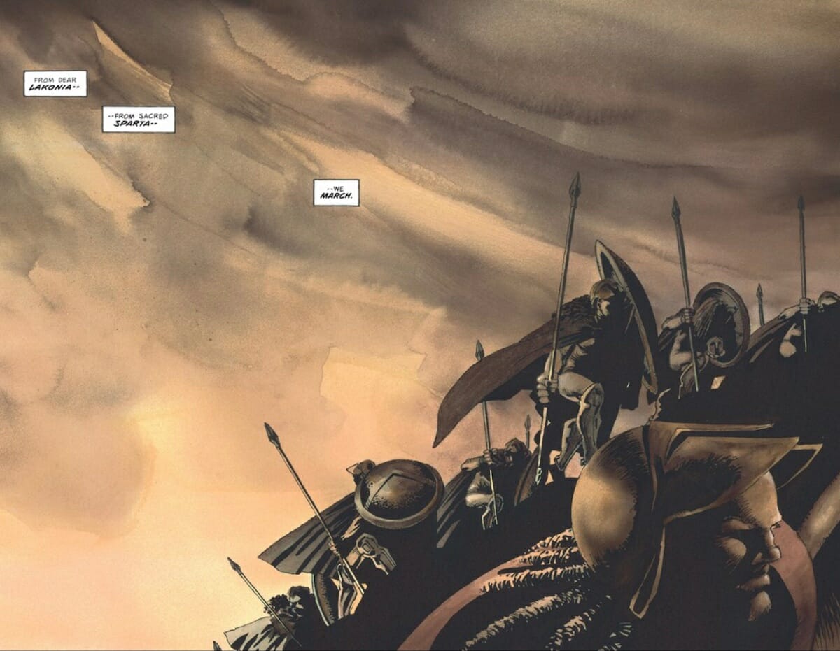
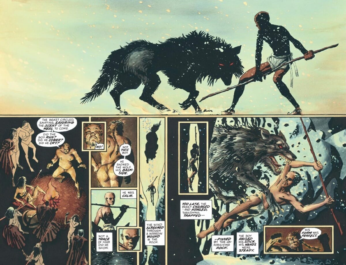
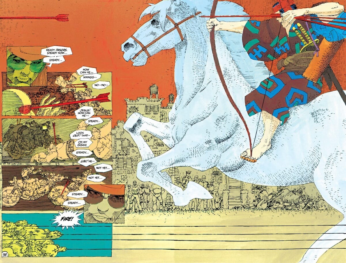
If the layouts of Miller made space for Varley to shine on The Dark Knight, the same is true to an even greater extent with a later collaboration between the two; 1998’s 300 — a retelling of Greek history as seen through a hyper-stylized lens in both visuals and text, transforming the battle of Thermopylae into something approaching myth. (The two had also worked together on Marvel’s Elektra Lives Again, and the original publication of The Big Guy and Rusty The Boy Robot by this point, as well as getting married to each other; their marriage would last through the early 21st century, ending in a divorce so acrimonious that Miller would take Varley to court over the accusation that she’d stolen artwork from him.)
Set against Miller’s brutal, blocky artwork, Varley provides 300 with beautifully lush painted colors that provide depth and subtlety otherwise lacking in the visuals, at once enriching and contradicting the spaces already on the page. Again, Varley’s choice of colors is quietly smart, evoking ancient artwork in its muted naturalistic hues, with occasional elements in stronger, more garish tones to stand out. Her colors feel as old as the story being told. Her work was memorable enough that she would go on to create backgrounds to the 2007 movie adaptation, directed by Zack Snyder, ensuring that the most beautiful part of the comic ended up onscreen.
The final collaboration between Miller and Varley is also, sadly, Varley’s last significant comic project — and one that acts as a frustrating sign that she was evolving her work and aesthetic into something entirely different that, again, was decades ahead of its time.
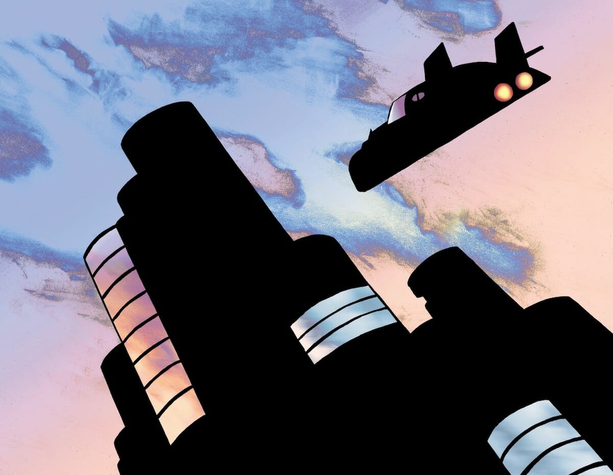
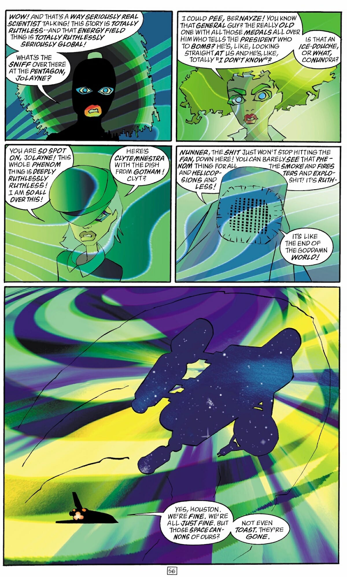
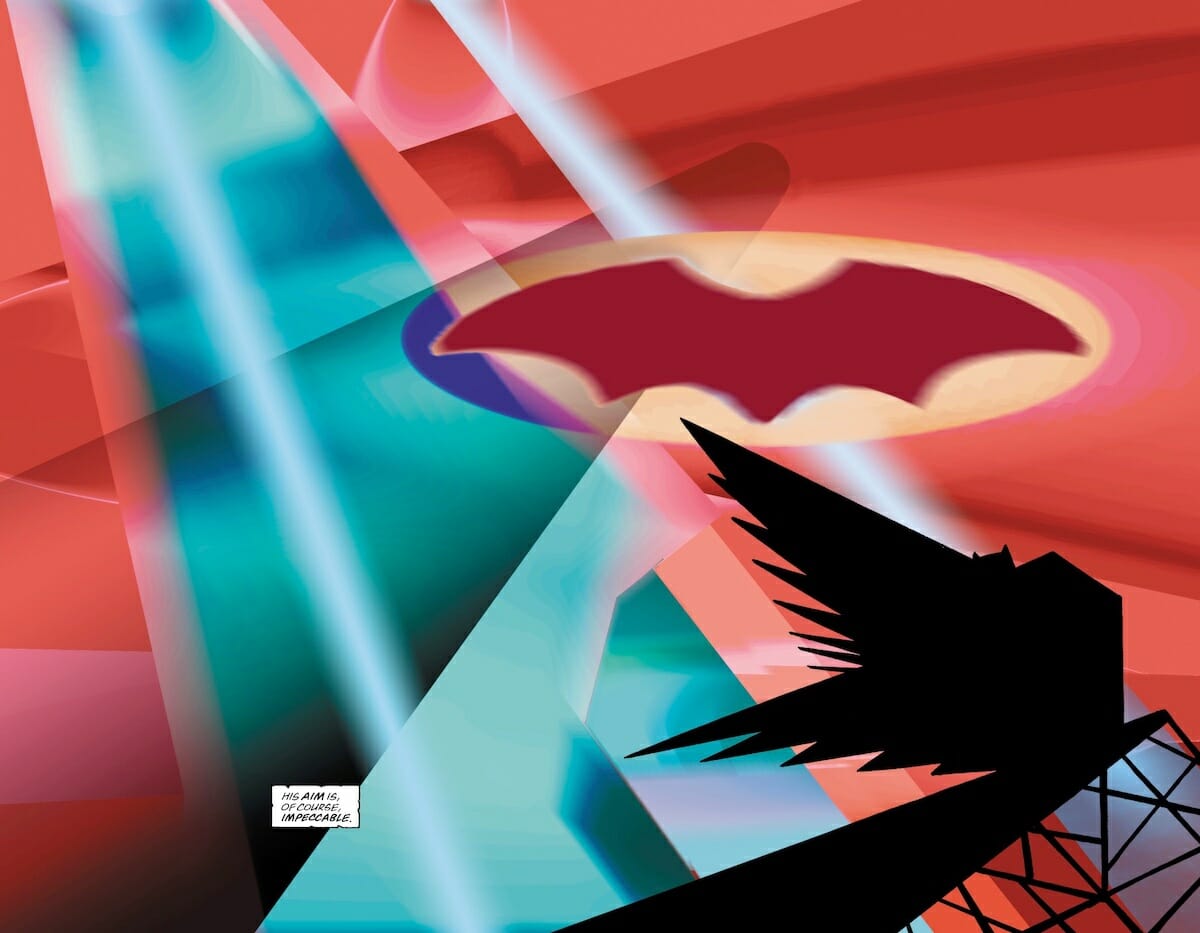
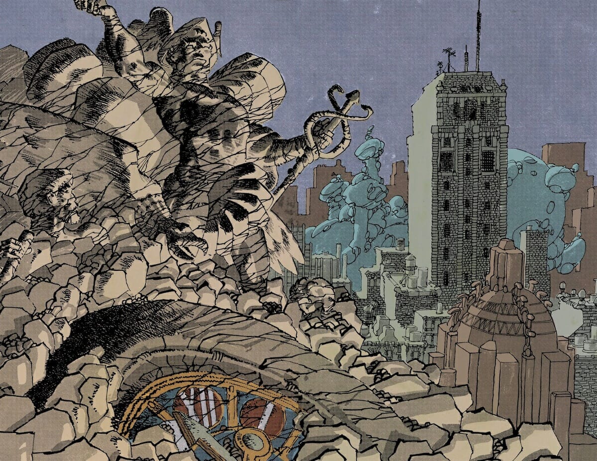
DK2 — also known as The Dark Knight Strikes Again — was a lightning rod of a series when it debuted in 2001, for all number of reasons. Clearly a reaction to Miller and Varley’s original Dark Knight and the many imitators it spawned, the work is also a pivot away from the aesthetic Varley had refined across the past decade-plus in such a way that it’s easy to imagine fans left with whiplash, if not outright despair.
Gone is the lush, subtle brushwork and palettes that work inside a realistic framework; instead, Varley’s colors for the three-part series embrace the potential of digital coloring with such vigor that it still feels bracing — gradients, pixelation and lurid color choices abound, creating a world that feels a million miles away from what Varley created for the first series.
The colors in DK2 feel like the work of a different artist altogether, with a different set of interests and even a different skill set. It’s a compelling, and in many ways shocking evolution from her earlier work, and something that suggests that Varley was that rare talent that had the potential to utterly reinvent herself for a new age — or, in this case, a new century.
That she has disappeared from comics in the wake of the series’ release is a loss for the industry and for colorists as a whole; while a new generation of color artists have learned from her work and followed her example in a number of ways, judging from her late period work, Varley’s absence from the industry has robbed us of a trailblazer who could have likely inspired many more for a long time to come.

