I try to avoid being overly-nostalgic, especially when it comes to culture, and especially when it comes to comics. Survivorship bias means the stuff that made it through, the works that get reprinted, has been through a selection process. We only get the best bits of what-was; while getting everything, including the worst, from what-is. With that being said… there’s a period of DC Comics, starting in the mid 1980’s and taking us to the early 1990’s, in which seemingly every comic-book looked good, looked exciting. How could this be? And, more importantly, who’s responsible for this stretch of greatness?
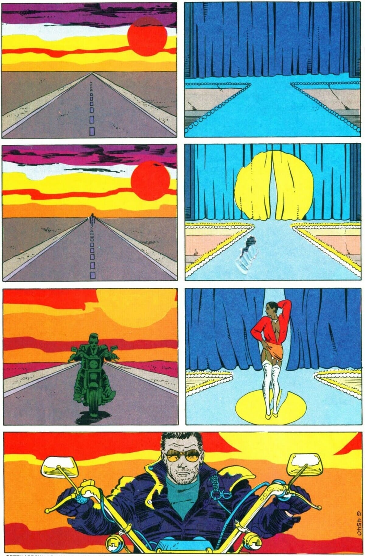
Green Arrow #17 (“The Horseman”) opens with a shot of a man riding a bike towards the reader juxtaposed with images of a woman performing on stage. Reading that scene, the first thing I noticed was how stark the colors are – the setting sun goes from harsh red into fading yellow, illuminating the skyline in a slightly surreal mode, as if the rider is coming for us from the land of nightmares.
The color of the rider also changes slightly with each panel he appears in – a slight grey blur when he’s far away, a greenish tint when he comes closer into view (helping him to pop-up against the red and yellow skies), and a more realistic, detailed, palate in the final panel when he’s right in the reader’s face. All of that is contrasted with the subdued colors occupying the performance parts of the page: The pale blue of the stage leading our gaze towards the woman in the center, her skin highlighted by the red shirt and the white pantyhose. She’s in the real world, he’s coming from someplace else.
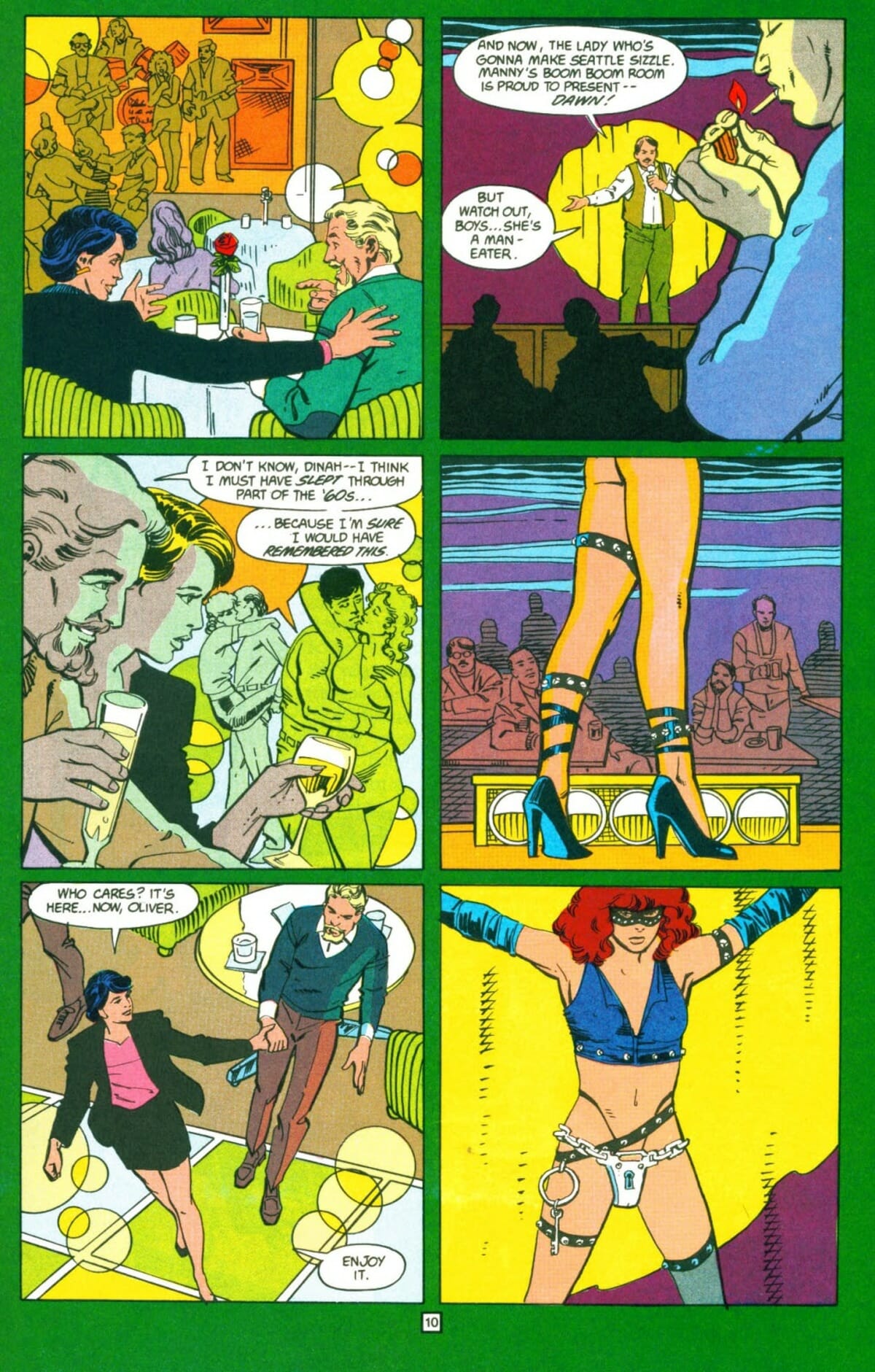
It’s as good an opening as you will find for a comic book, intriguing in the contrasts it offers both within the two narrative strands and between them. And the issue doesn’t let go from there, just about every page is a blast to look at – existing in a sort of heightened reality of urban degradation and violent existence, this is what most Canon movies dream of looking like. “The Horseman,” and just about any other issue of the Mike Grell-written Green Arrow run (collected in the Longbow Hunters Saga omnibus), was colored by Julia Lacquement.
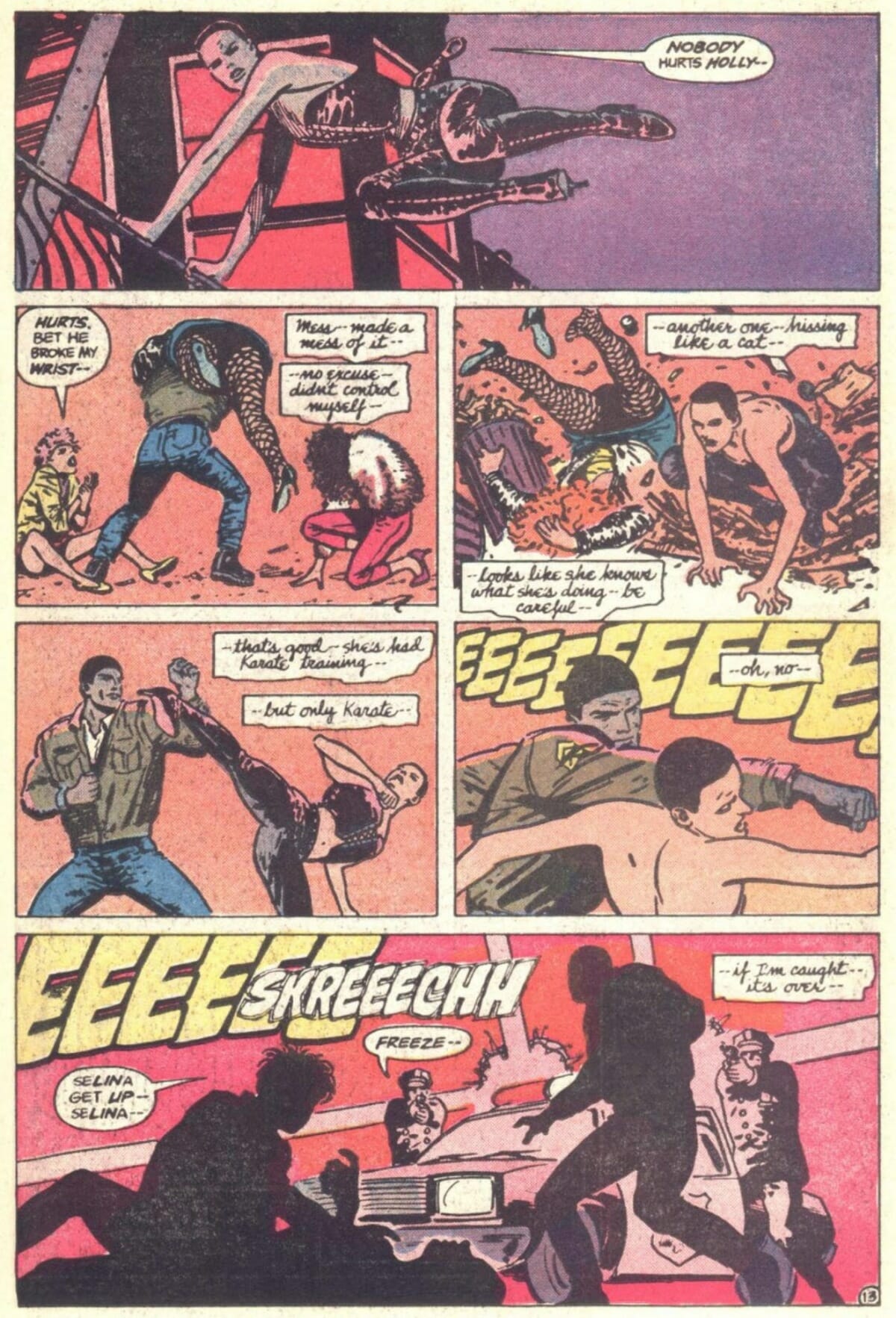
Other than Grell himself, Lacquement is the unifying force in that run of Green Arrow, hitting one home run after another as artists switch around her. That run of comics had its fair share of issues (Tegan O’Neil’s seminal article, Jerk City, USA, is a wonderful exploration of the reactionary elements of Grell’s writing) but the coloring was never one of them. Which is why it’s so sad that Lacquement is so under-discussed. After Green Arrow she was part of another seminal part of comics history, coloring many of the Milestone comics, including Hardware, Static and Shadow Cabinet. After which she pretty much disappeared from the comics medium.
Lacquement’s story is, sadly, not unique. There’s a whole movement of women colorists who pretty much defined how DC comics in the late 1980’s and early 1990’s looked like: Lacquement herself, Tatjana Wood, Adrienne Roy, Michele Wrightson, Richmond Lewis, Lynn Varley. They all brought to the medium to some of its highest peaks (Varley, in particular, is still ahead of the pack decades later) only to be booted out without so much as a thank you. Considering how many of the books they worked on are now celebrated classics, it’s weird that their names are not as well-known as the writers and pencilers who contributed to these issues. Reading through their catalogue of works, and what little critical and analytical material about them (such as Chloe Maveal’s appreciation of Lynn Varley), I couldn’t help but consider the role of the editor in Hollywood cinema.
Many of the greatest film editors, especially in much-celebrated ‘New Hollywood’ were women: Lynzee Klingman, Marcia Lucas, Françoise Bonnot, Lisa Fruchtman… yet it was that period was when the director became celebrated as the sole creative force of the moviemaking project. Girish Shambu’s article, Hidden Histories: The Story of Women Film Editors, notes the early roots of editing as ‘cutting,’ a physically laborious, low-paying, low-appreciation effort: “Because “cutting” was considered menial and monotonous work similar to knitting and sewing, it became common for young women with little or no professional training to be hired as cutters. When male figures such as D. W. Griffith began to emphasize the editing function of cinema through devices like cross-cutting, the perception of editing underwent a transformation.” While editing, now more prestigious, became more of a ‘men’s work’ the foot was already at the door.
Some of the most capable editors in Hollywood’s history were women as well. David Meuel’s book, Women Film Editors: Unseen Artists of American Cinema, has a chapter on Dede Allen (who edited such films as Bonnie and Clyde and Dog Day Afternoon) and the way her unorthodox method received much objections from studio heads. Jack Warner reportedly loathed her work on Bonnie and Clyde and sought to replace her entirely: ‘From the very first live-motion shot, when viewers see only a young woman’s painted red lips in extreme close-up, the experience seemed alien, confusing, and probably very amateurish to [Jack Warner]. “Why begin there?” he must have been wondering. “Lips don’t tell the viewer anything about where or when this is supposed to be.”’ The answer, of course, is that the editor wasn’t trying to establish location or period, she was trying to establish a tone.
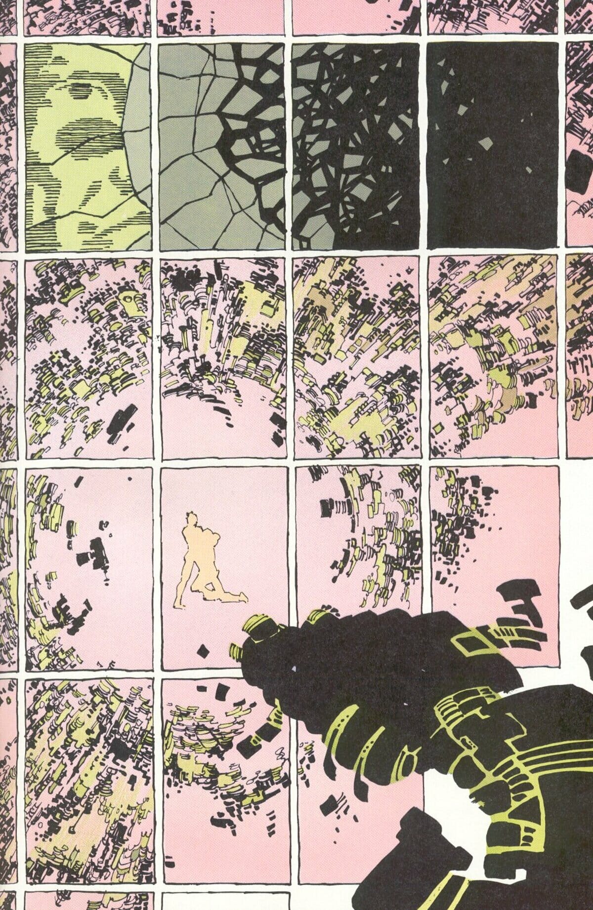
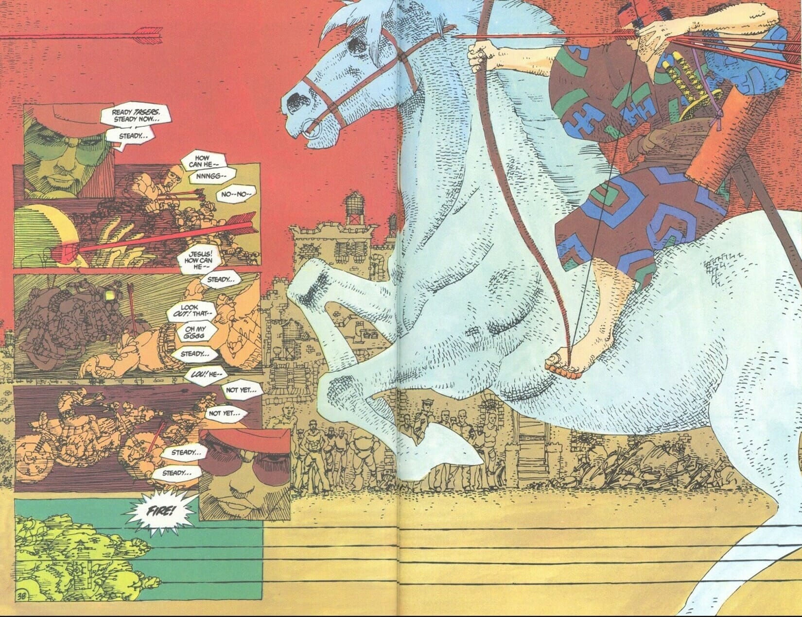
All of which brings me back to these colorists. The thing that all of them did so well, that set them apart (and above) many that preceded them and that would follow, is the emotional resonance of their work. They don’t go for realism, at least not as an automatic choice; their colors are constantly used to add to the emotional tone of each scene. Partly, it’s motivated by technological limitations: we are talking pre-computer coloring, we are talking cheaper pages, less chance for a redo. They did what they could with what they had. Much of what we see today, comics in which every little part of the character and scenery is colored with the same level of attention, could hardly be achieved at the time without back-breaking labor; and even if achieved it would not be as good on the type of paper available. Varley’s work on Ronin is an outlier, every single page of that series could be someone else’s career highlight, but in that case part of deal was that Miller and Varley would have larger lead-in time to make every issue and that they could pick the type of paper themselves.
Still, even if the type of work they produced was limited by the technology of their era (there are always limitations) they found a way to make these limitations work for them. Lacquement’s use of solid blocks of color as background in many instances throughout the series might be used to paint over the lack of detail in background art, but they also serve as mood enhancer. Once you get used to it you the effect becomes almost magical, pushing past the reality of the scene and into higher dimensions of being. Like the special effect artists of the pre-CGI days, who had to get creative sans the ability to animate monsters onto the screen, these colorists found creative ways to express everything they needed to express. Their success wasn’t in the small details, it was in the big picture.
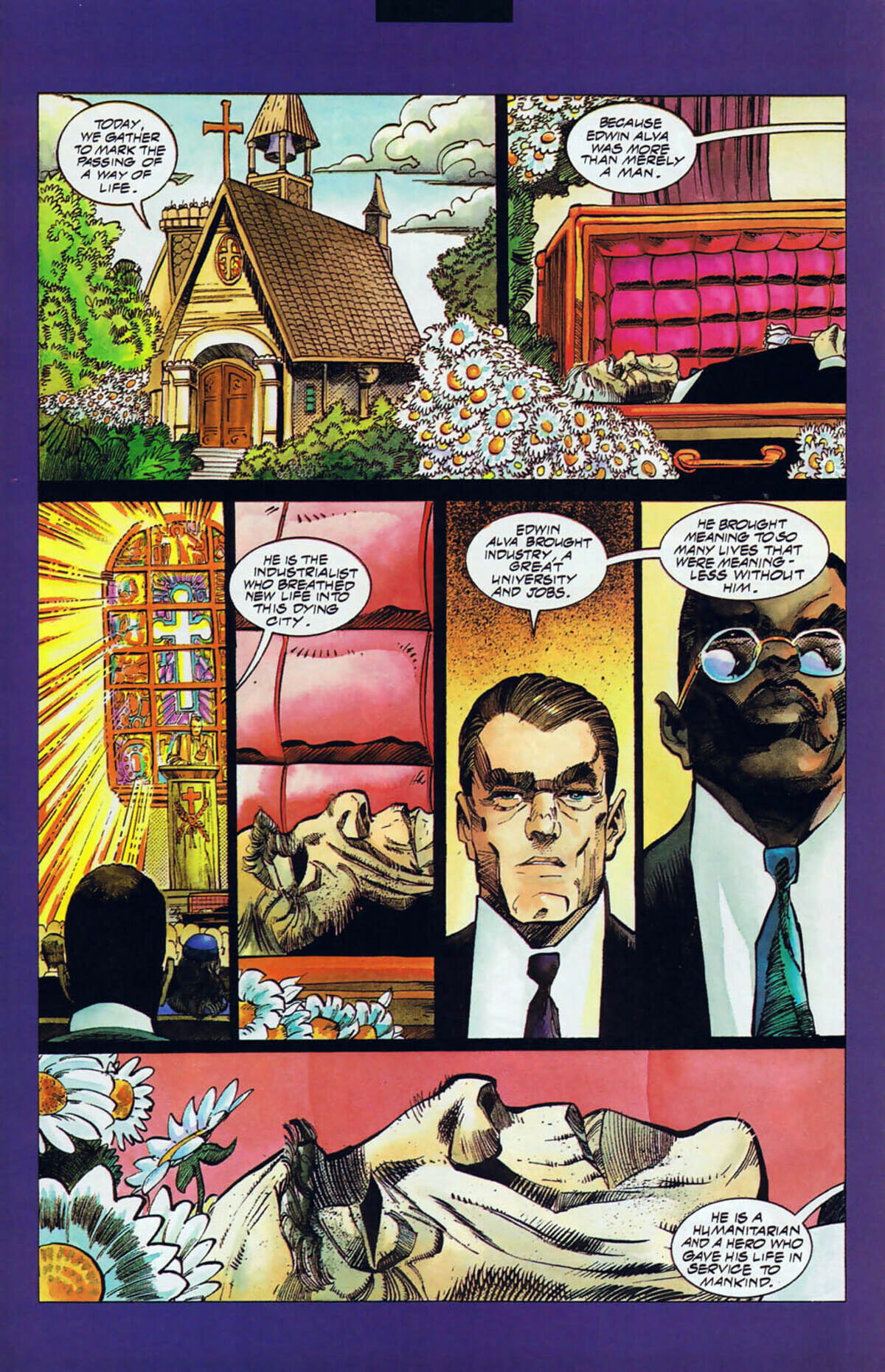
Adrienne Roy, whose name is credited in more Batman comics than anyone else (other than Bob Kane, who doesn’t count), basically set the tone for DC’s most successful line of comics of the time. Her work on Batman, Detective Comics, and Shadow of the Bat gave us the popular conception of Gotham city as the dark, dense and dank environment – specially tailored to its grim protagonist. Her colors are big and bold and dramatic; and garish. ‘Garish’ is often thought of as a bad word, I don’t think so. It means ‘excessive’ or ‘vivid’, which to me reads as ‘emotionally honest.’ Roy’s colors often don’t show you how the world looks like, they show you how the world feels.
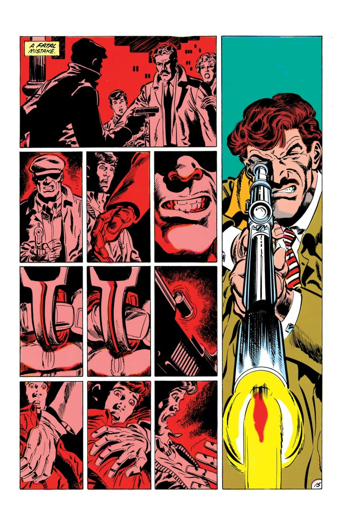
A good example can be found in Batman #430, written by Jim Starlin, penciled by Jim Aparo and inked by Mike DeCarlo. On its face it’s the type of story that calls for realism throughout, in all levels of the comics. Instead of one his colorful rogue gallery Batman is taking on a decidedly human sniper in this issue; befitting the post-Frank Miller grim & gritty era Aparo breaks down the page into many small panels, using the tight structure to highlight individual actions and provide clarity of storytelling (alongside his naturally strong fundamentals). Yet Roy is operating in a slightly different sphere. While her work begins by emphasizing down-to-Earth tones that evoke the ‘grittiness’ expected in such a story, she slowly builds-up her choices throughout in a manner that allows us to glimpse at Batman’s inner world as much as the verbose narration.
Batman’s flashback to his childhood, inserted throughout the story and contrasted with the current shooting events, begins with strong golden hues – evoking the notion of childhood as this golden era in which everything is peaceful and lovely. When Batman is recalling, instead, the night of his parents murder the colors go blood red. It’s simple, red blood is violence, but it works. It puts us in the headspace of the character and lets us know, at a glance, what the comics is all about. You can’t do it with (attempted) realism, Roy rarely tries to because she realizes the heightened nature of the stories she worked on.
Richmond Lewis is probably best known for her work on Batman: Year One. Lewis actually got two cracks at the story, recoloring the story for the first collected edition. As opposed to many recoloring these days, that try for affected naturalism, looking at the two Lewis examples shows she actually took some chances at playing up the contrast and deepening the impact of solid backgrounds. The reds simply pop more in her updated version, allowing the black silhouettes of the art to stand out. Again, this comes from her understanding of the type of story being told and the way the colors could be used to enhance not just the readability of each scene but also the emotional impact of it.
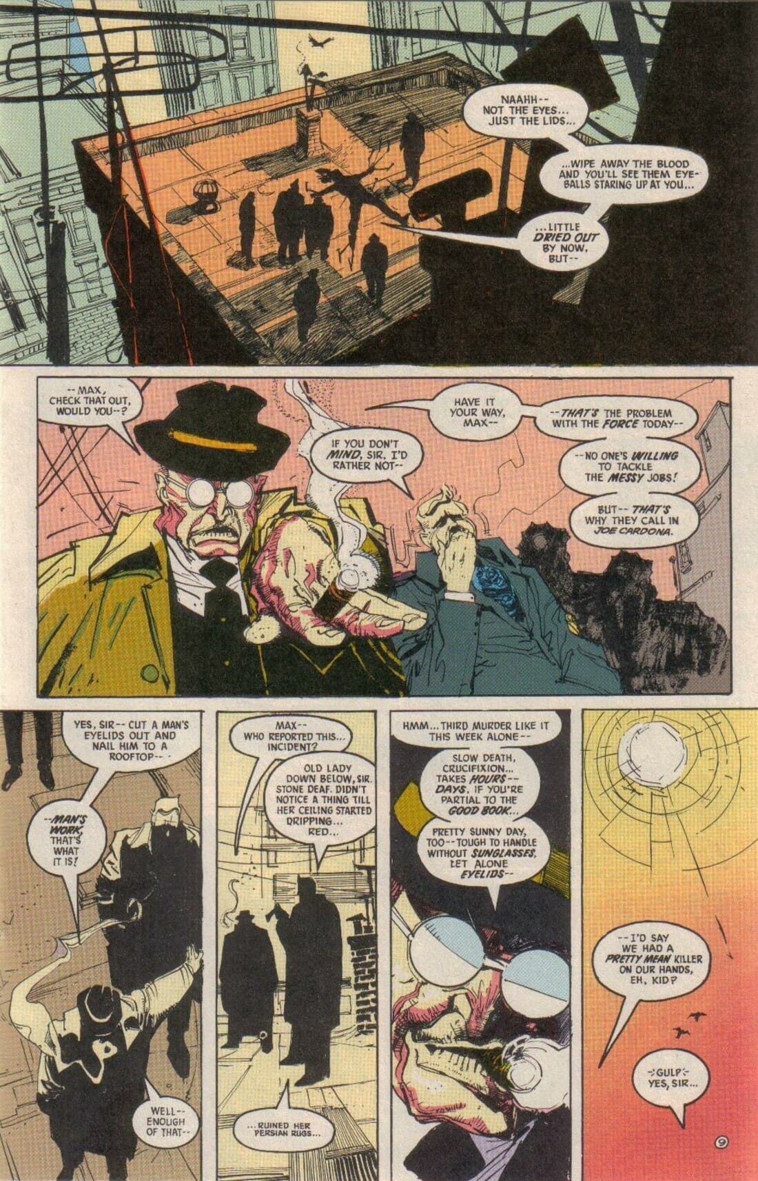
However, also deserving our attention is her short run on The Shadow, coloring the first six issues drawn by Bill Sienkiewicz. Bill’s work is much more out-there than the naturalism Mazzucchelli went for in Year One, as a result Lewis’ work also goes all-out. This page, from The Shadow, shows a scene taking place atop a tall building in the middle of the day: the sun isn’t just out, it’s attacking! Even before you see Sienkiewicz’s rendering of the sun in the final panel Lewis’ colors let you know how these character feel, you can sense the heat on their skin and cloths; without needing to show drops of swear you can bet these people are boiling, the mood is boiling, the city is boiling…. Everything is about to explode.
All of that is lost to us now. The computer coloring revolution brought a lot of positive changes with it, nothing that makes a worker’s job easier could be all bad, but it also helped push a lot of talented creators away from the medium. The shift to full on computer coloring in the 1990’s led to a slow immigration of many past greats, like an entire branch of the industry got cut at once. Tellingly, many of these creators were women – so easily left in the side of history. Oft forgotten, oft ignored.
More than these colorists, what was left behind was an entire way of doing things. I am not talking about returning to the physical manner of coloring, that wheel is not being pushed back (and I’m sure no one would like to go back to memorizing codes and limited options). I am talking about a philosophy of doing things. When color was first introduced to cinema black and white filmmaking didn’t vanish overnight. The Oscars had separate awards for best color photography and best black and white photography until 1967 (!), the people making these films were not doing it for lack of budget, or as a ‘gimmick.’ They understood black and white isn’t a limitation, it’s just a different way of doing things, a different way of presenting the world.
We lost something when it did become a gimmick, something which isn’t thought of as just another option but something done only from lack of resources or as an homage to the past. At least these old films are not being recolored, the disastrous Ted Turner attempt in the mid 1980’s was deemed as nothing less but ‘vandalism’ by the likes of Roger Ebert. Comics do.
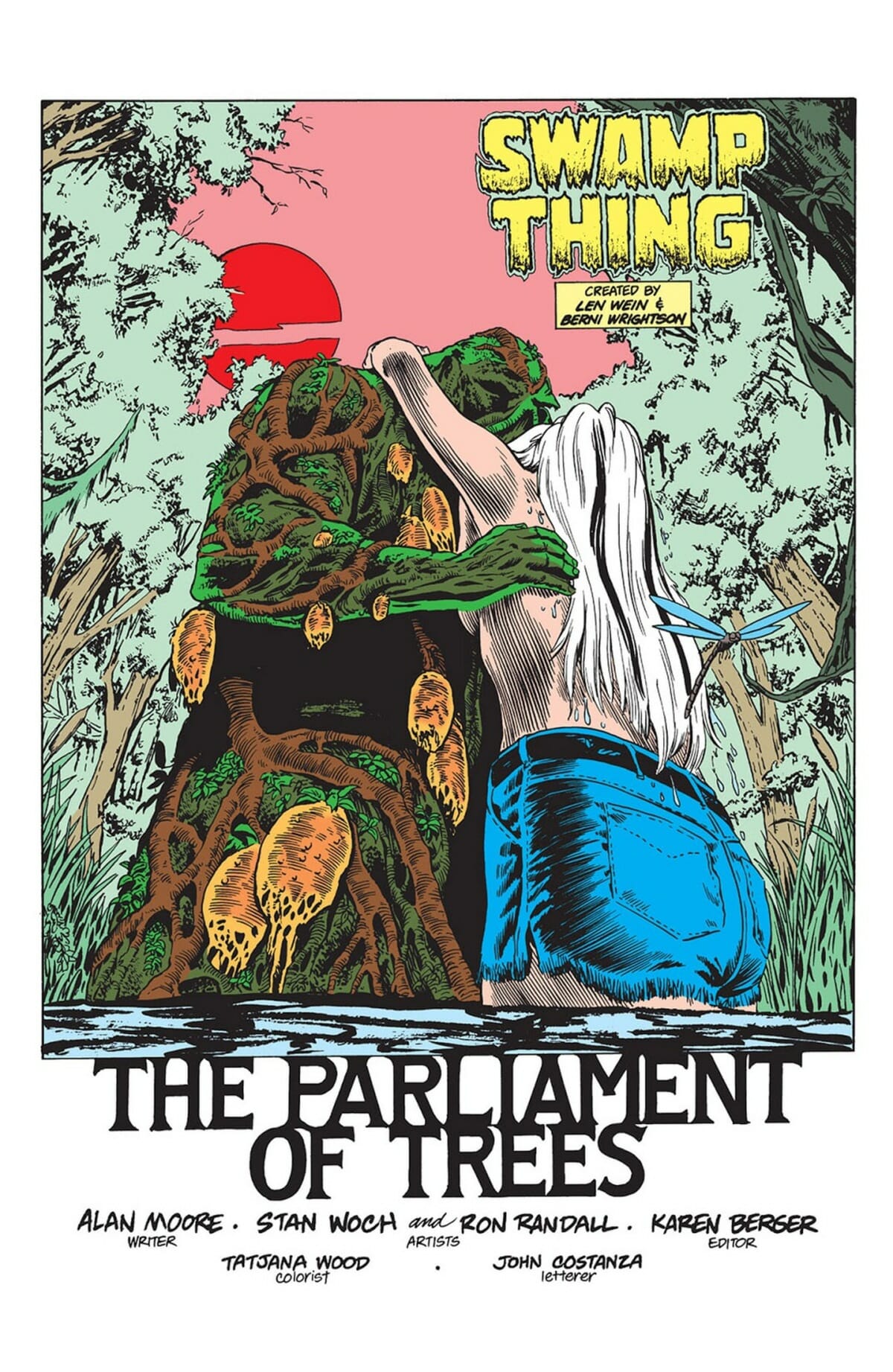
Colorists don’t get the same amount of respect. Tatajana Wood’s lyrical work on Swamp Thing in the 1980’s, visceral and raw, is being recolored for the Absolute editions. Replaced by something so thick and heavy it seems to overwhelm the lines, drowning the fine work of pencilers and inkers she worked so hard to accommodate. In a way, it doesn’t really matter if the work is improved (it does not) – history is history, we do not erase it to accommodate modern taste; (or some higher-up idea of modern taste. Would you re-edit a classic film to be more in tone with modern sensibilities of film making? Think of coloring in the same manner, not as an element meant to ‘assist’ the work but as part of the whole.
Over the last year I found myself reading more and more comics from that period, the post-Watchmen period of the late 1980’s / early 1990’s. It’s not a nostalgia trip, much of it was published while I was too young to read and certainly none was available in my country in real time; there’s just something to it that kicks, something raw and powerful. That post-Watchmen period gets a lot of flak nowadays, and certainly much of it is justified in terms of self-importance of ideas vs. execution, but these comics just looked good.
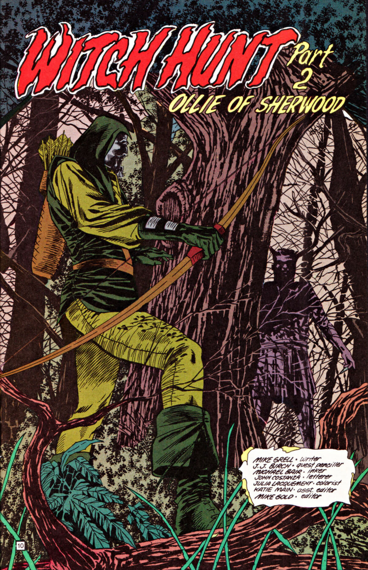
They looked good because the people who made them felt freed to give it their all. Even if it was just a random issue of Green Arrow, Julia Lacquement colored it like it’s the most important piece of art ever made. Issue #40 features Grell attempting to grapple with the magical history of Britain, with the beliefs of Druids, with spiritualism. It could be read as hokey, but the level of commitment to the craft elevates it. Lacquement paints it like its, and so it becomes art.
Look at that title page – the strong dark greens in the foreground plants, complimenting but never obscuring Green Arrow himself, the manner in which they give way to these trees, the light barley breaking through the branches providing this purple-ish hue. The roughness of it all merely adds to the charm, this is a nature scene and it should have a degree of coarseness to it. The old faded paper, the limited palate – in the hands of the master they become tools rather than hindrance.
That’s what these women were: masters. They defined a period and they defined a publisher. Today, decades later, when we think about all the works now recognized as classics – works that have stood the test of time – we should always remember who made them.
The world moves forward, as it always does. Doesn’t mean you get to forget the past.

