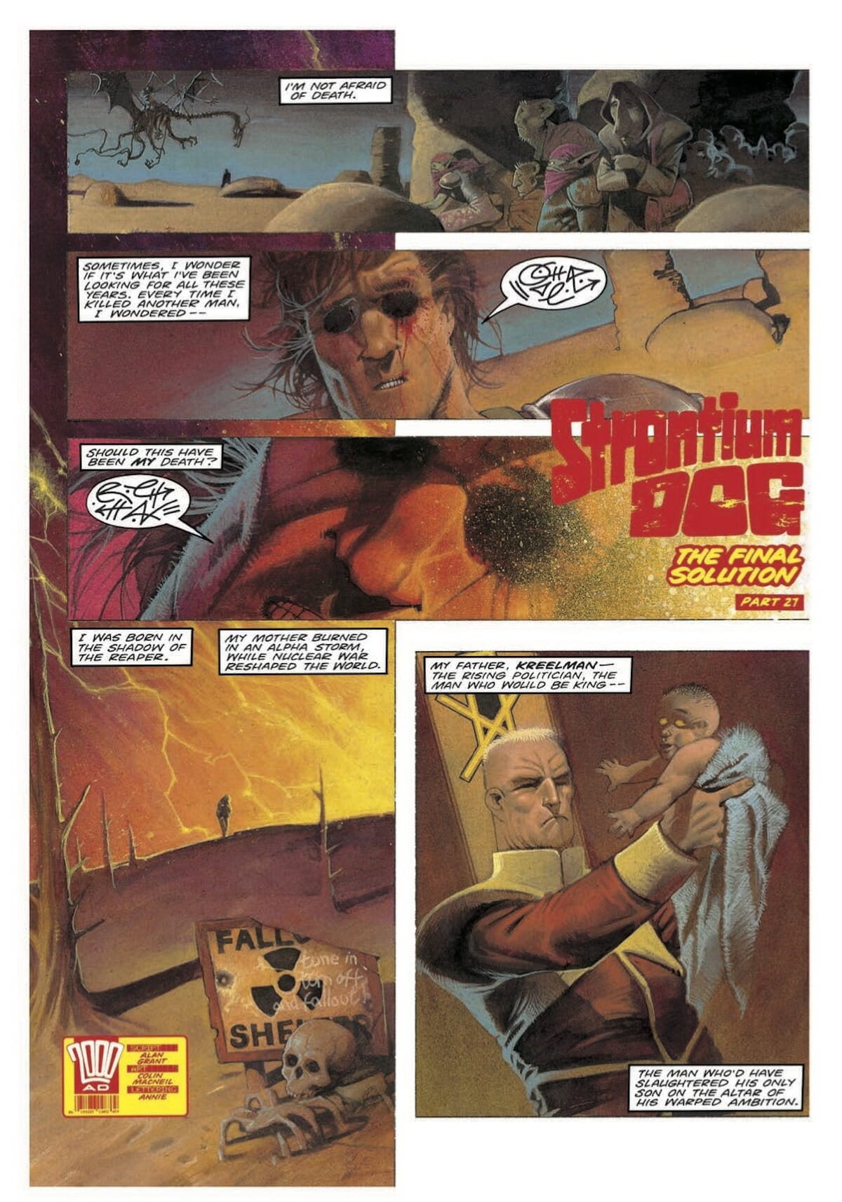
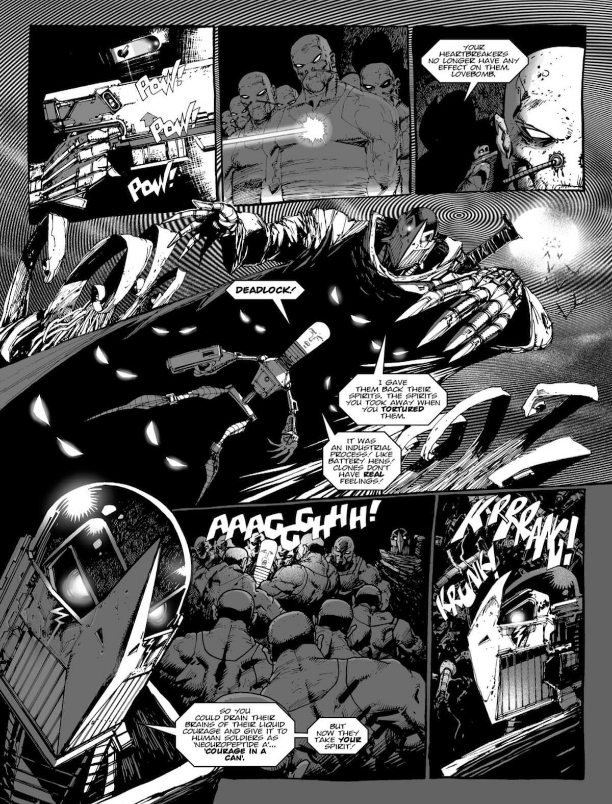
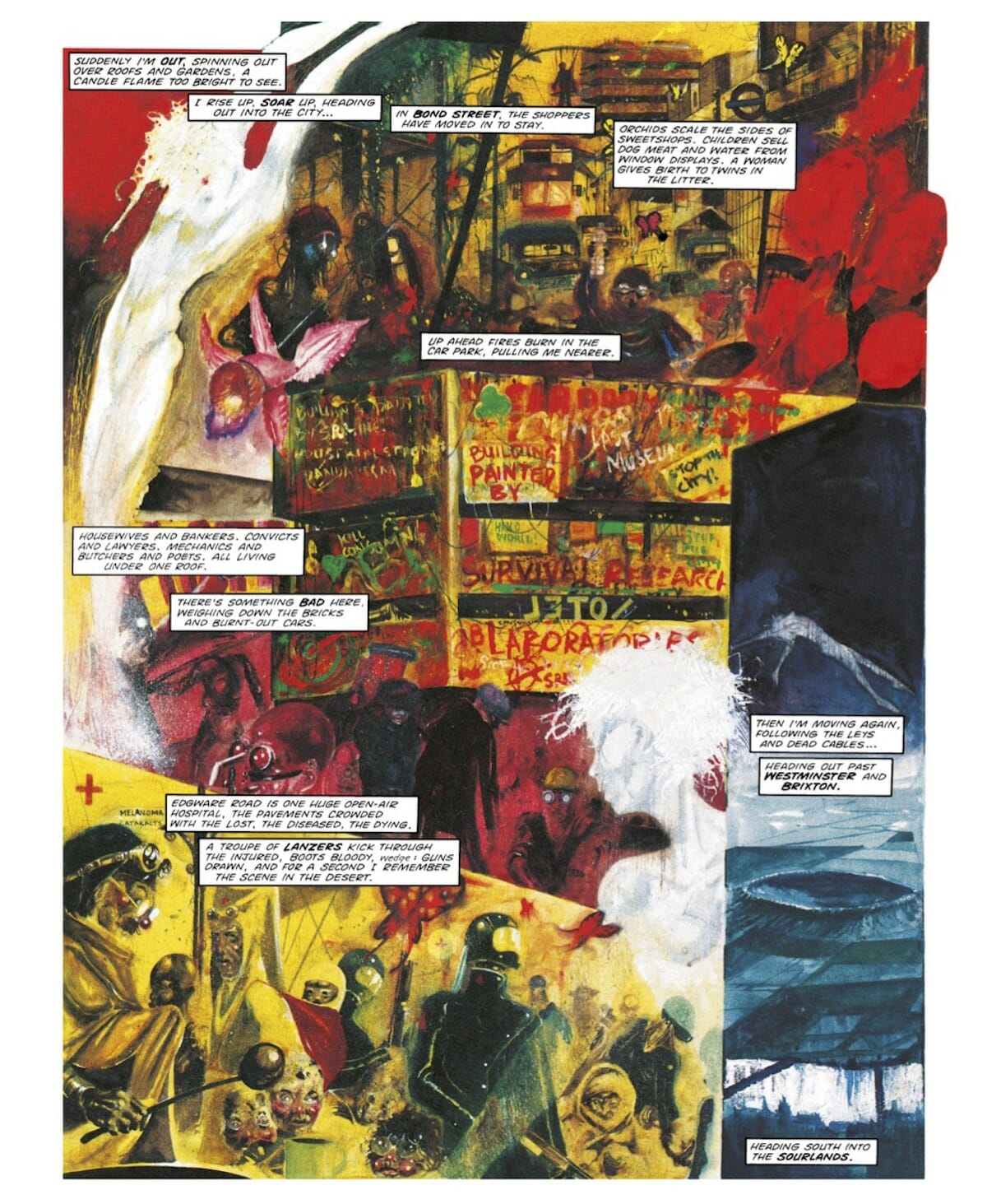
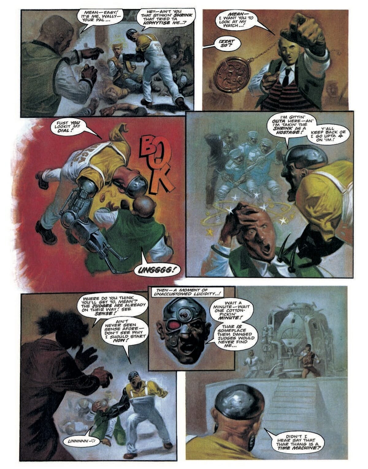
When it comes to art, many comics fans from all over the world are able to name their favorite creators. Ask any one of your nerd friends for the comic artists they like best and they’ll certainly start spouting “Bill Sienkiewicz!”, “Chris Weston!”, “Steve Ditko!” and a laundry list of talented others like they’ve been waiting with a list on the tip of their tongues. When it comes to comics, however, the art isn’t always solely in pencils, inked shading, and the addition of color; but in the rhythm, flow, and emotion behind what could otherwise be mistaken as a simple script of words made by the invisible and sadly oft-forgotten comic magicians called letterers. And who better to talk to about the importance of lettering than British comics absolute lettering legend: Annie Parkhouse.
With a career spanning over 30 years, Parkhouse has become a staple of the British comics community — well-loved for her skills behind bringing tone and vibrancy to the scripts behind Judge Dredd, Nikolai Dante, Captain Britain, Slaine, and so many others. If there’s a British comic strip that’s run within the past thirty years where you’ve read the comic and gone “this reads so well!”, chances are you should be thanking Annie.
Luckily, NeoText was able to speak with Parkhouse over email to discuss her career, the evolution of lettering as an art, and what it feels like to be the woman behind the curtain.
From my understanding, you sort of landed into comic book lettering as something of a mistake. Can you tell me a little bit about how you got your start from working on staff at Lion?
My mother worked as a book-keeper at a printer and newspaper publisher. I would go in to make a bit of money during the holidays, putting advertising inserts into catalogues. They printed Oz and Scientology publications. I recall the Golden Oz messing up the huge Heidelburg press and the Perfumed Oz making everyone feel ill. When Ron L. Hubbard visited, I didn’t know who he was. I found the print process very interesting. It was web offset then. They also printed many of the comics for IPC Magazines.
In 1970, my mother had been complaining about me being unemployed after leaving school as I had turned down a University offer. The sales director of the printing company said he would take me to IPC in London to see if they had any jobs going.
The offices were in Farringdon Street, round the corner from Fleet St. I visited the girls’ magazines but they needed someone who had a year’s graphics training, as they wanted someone they could finish training themselves. I was sent down to the juveniles [boys’ comics] on the floor below to meet Jack LeGrand. Usually they took people on at 16 as post boys or girls so was told I was ‘too f***king old’ being 18, but they’d give me a trial. At that time there was a ratio between SLADE union members and the NUJ. I should have been in SLADE because I was working on the artboards, but there wasn’t a union place so I was put into the NUJ. This meant that if the FOC [Father Of the Chapel, the name of the union representative ] walked in I had to drop a pen or brush I was using to ink and pick up a pencil. It was all quite arcane.
That’s when I began work on Lion, preparing art for printing. Cleaning, drawing up if the artist had left too much room for the lettering — as if that happens these days! — and making lettering corrections/changes.
What was it like during that period where IPC was still very structured and corporate, especially as someone who didn’t come from a pointedly art-related background?
I think I came from more of an art-related background than was required! I’d spent about 4 years hanging out at the local art college informally, making sculpture and attending life drawing classes. As you say, IPC was corporate and we were just part of the process of getting work in and out. Many of us were quite young and were a bit frustrated at the lack of space for creative ideas. Management was a different generation and kept repeating what they felt comfortable with. Quite a few of us left around the same time.
How long were you with IPC exactly? And for that matter, what was the working environment like during those days? I hate to shrink it down to gender as it so often is when we talk about women working in comics back in the day …but did being one the few women in British comics at the time take a toll on you while working in that environment?
I was there for two and a half years, moving onto Valiant after Jet and Thunder [under the Lion editor] were unsuccessful. There were very few women on the boys’ magazines, though plenty on the floor above on the girls’ teenage magazines. It didn’t take any toll at all and I ended up working for some of the men after they moved on from IPC. The working environment varied with whichever magazine you were working on. Lion was very different to Valiant due to a different editor.
Was there much difference for you working on 2000 AD and Fleetway titles versus your work with Marvel UK? Is there a particular publisher or editorial office that you feel was your dream, in terms of employers?
Once I was freelance in 1972, there was no real difference between publishers. Being free-lance was my dream job!
Just from reading about comic manufacturing during the 1970s, it feels like it was a pretty piecemeal production based on who was doing which parts of the story work. How did you manage to piece everything together, when I assume many stories weren’t even finished being drawn by the time you received pages to be lettered?
It was a well-practiced process. The artist would send in pencils for the art editor to pass. He [and it was a ‘he’] made sure there was room for the lettering before sending it back to the same artist to be inked. Lettering was always a pretty rushed job. I would often go in to letter the art as it arrived. Turning it around within a couple of hours whilst the van was waiting downstairs to take it to the printers. On one occasion I worked all night with an artist to letter as he finished drawing a graphic novel. He treated me to breakfast! The unfinished art relates more to when I was on production, it didn’t affect the lettering.
I think one of the reasons why letterers so often get overlooked is that a lot of people assume that the art of lettering is just slapping the writers’ words onto the page. Can you tell us a bit about the things you have to take into consideration when planning out a page?
I think, due to time pressure, there was more ‘slapping words down’ in the past. You only have to look at lettering of previous decades. Comics were seen as ephemera and there was no time to be very fussy. Now, it’s very easy to go over, and over what you’ve done to get it to read a bit better. I sometimes take a page apart 2 or 3 times until it’s how I want it. Artists won’t leave enough space. I can understand that a frame looks empty to them if they leave the top third empty, but the balloons soon fill it. The ‘old hands’ were more understanding of this.
In spite of some tricky frame layouts, I still try to take ‘pace’ of the exchanges into account whilst making sure the whole page reads with little effort. I want the lettering to be as much in the background as possible to let the art tell the story.
What are some of the pros and cons of working in a more contemporary, or digital, way? I’m sure there’s much less hassle, but I’m sure there are some ways in which it’s much less fun or satisfying even from a tactile sense.
I find it less satisfying to receive a lo-res jpg than the original art boards. It could be challenging when some art was so encrusted with paint it was difficult to draw a line over it, even over acetate. I did far more work by hand and found it faster. Not having to package boards up and walk to the post office, plus the huge expense of materials and postage, is a definite advantage, but then computers are expensive so it probably works out about the same. Materials and post were probably 10% of my income back then. It’s crazy to think how I used to receive boards from Orkney, which was then Fedex-ed to New York, or from Croatia which were then sent to Oregon.
Does working digitally make it harder for you to put work down? I know many creators who for ages worked in traditional art tend to get caught up in the spoiled nature of being able to constantly change and delete and tweak thanks to digital work.
Indeed it does. I look back at some hand lettering and am appalled how haphazard some of it was. It didn’t enhance the art very much, but it wasn’t just me, it was part of the throwaway approach. I have to limit my tweaking, but I can’t let it go until I’m satisfied. It must be worse for artists, getting tied up in details which will disappear once the work is reduced and subject to the vagaries of printing and paper quality. One thing which I’m curious about is that comic book fonts have become so manicured they are becoming similar to traditional typefaces. Because my font is taken from my hand lettering and is a bit wonky and the kerning is off, I think it puts me out on a limb, but I really want to hold on to it. Some artists ask for me because of it.
You seem to work almost exclusively digitally these days. Do you prefer one method of lettering to the other? Is there anything you miss from the early days of paste-ups and hand-lettering?
I miss the craft element of using materials. I joke about the smell of Cow Gum in the morning, but I’m sure it wasn’t safe for us, especially in the days when most people smoked. Sitting for hours at a computer takes its toll. I’m pleased to hear that more artists are working out and being more healthy to counteract that now. In the 70s, it was so unhealthy. You could barely see across studios for the smoke. At IPC, I worked with a woman who chain smoked. I sometimes feel like a typist, which almost happened when the IBM ‘golfball’ typewriters came in and publishers thought they could just hand lettering to the typing pool. That was a serious low in the industry. No disrespect to typists, it’s just a different job.
How do you feel about your career now? You’ve gone from being someone who stumbled into the position over 40 years ago to someone who is considered on the highest podium of not just great letterers, but great figures in British comics.
I wouldn’t use the word ‘stumbled’. It was more life taking me in a direction I hadn’t thought of at the time. It has continued that way as work ebbed and flowed, and I’ve had to do other things to keep afloat at times. It has still been a constant. I’ve met wonderful people, made good friends and it has been fascinating to watch how the industry has developed. At times it seemed that it would collapse. It’s surprising how many people in the business started out on a different career path originally.
Are there favorite projects that you’ve worked on? Or rather, are there specific challenges that you can remember tackling — and beating — that stick out in retrospect?
Not really, sometimes it’s the quality of the artwork, sometimes the story, sometimes the length of time I worked on a particular story. For example, I was the letterer of Nikolai Dante for 15 years, which combined all of the above. I loved America, it was an emotional trip. I’ve worked closely with Clint Langley and that was a rewarding experience.
Lastly, I have to know — how do you view lettering, personally? Do you consider it an art form that some people have a talent for, or is it a skill that can be learned and applied by anyone with enough patience? Has your attitude towards it changed across your career? (Are there specific letterers that you admire, and if so, who and why?)
I see it as a problem-solving craft. I try to bring the art and the lettering together in the most effective way, in spite of the obstacles. I did train in design and found that I had an instinct for it. I recall a student on the ceramic design course I did who thought that if you put a handle and spout on a pot it automatically became a jug or teapot. He was design blind. He couldn’t understand balance, weight or dynamics. It was then I realized that it wasn’t something that everyone could do. That is why the IBM typewriters weren’t a success in comics.
Hand lettering takes practice. My father taught me copperplate calligraphy, and school taught me italic script. This was a time when handwriting was considered important. As a ‘bodger’ on comics I had to copy various styles to make changes or corrections to lettering, so doing it full time was easier to slip into. Writing Christmas and birthday cards is the only time I use it now, though I still have my pens!


