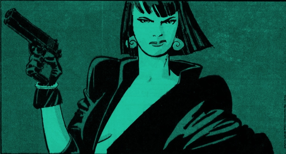
One of the best reasons to trawl along back issue bins is the chance to find something you haven’t seen before. I’m not even really talking about the comics stories themselves – these days just about anything and everything has been collected, reprinted, redone or digitized for broader consumption (well, almost everything – where’s my Nth Man, The Ultimate Ninja collection?!). No, the one thing you can find in old issues that you probably wouldn’t find anywhere else are the house ads; in-company commercials for future stories, series and events. Comics’ own versions of trailers.
Just like movie trailers, house ads are an important part of the deployment of the medium that is often cast aside, because they represent an uncomfortably naked commercial aspect. Also like movie trailers, they are often much better than the actual thing they exist to promote. Take, for example, the house ad promoting the mostly forgotten Dakota North miniseries from 1986: it’s a thing of wonder; of beauty, even. Tony Salmons, an artist known more for his comedic touch, draws the self-assured protagonist gazing directly at the reader, holding a gun to her side, not pointing at the reader or any possible antagonist (this is a pose rather than a promise for action). Her jacket opens, promising something that wouldn’t pass the PG-13 rating, only to be blocked by the title of the series. Above her, a single word with dots enhancing each letter: S*T*Y*L*E.
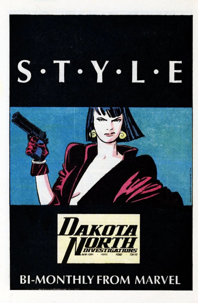
It’s such a note-perfect evocation of that famous adage about how “all you need for a movie is a girl and a gun” (a quote attributed to Godard, but goes much further back to the days of Birth of a Nation director D. W. Griffith). It promises everything the reader might want, and it owns, entirely, any criticisms that might be lobbed at it.
Is it shallow? Exploitative? Pandering? Heck yes! It’s STYLE. Nothing in the actual series looks quite this good, though possibly this has more to do with the terrible print quality. To this day I can post that particular house ad on social media and pick up engagement like no one’s business – you don’t need to know anything about Dakota North to be impressed by it. The image is iconic enough to stand on its own. What it promises, nothing can truly deliver. Better stick to your dreams.
Here’s an important thing: I attribute that the ad was drawn by Tony Salmons (and probably colored by Christie Scheele for that matter), because he was the artist for the series and he has a rather unique style (sorry, S*T*Y*L*E) of his own. But his name isn’t on it. For most house ads, especially in ye olden days, you won’t see artist signatures, and finding out who made what is a game of guessing and digging. It’s a massive part of the comics industry – or used to be before the internet pushed all ads online and off my mind, that has almost nothing written about it.
I searched high and low and found no official or unofficial histories, just occasional blog posts extolling this or that ad, or recognizing a particular artist as responsible for a particular piece. I probably don’t need to tell you that movie trailers aren’t ignored in the same manner. I know more details about some pages of comics than I do about the whole endeavor of house ads. Brian Cronin had a series about comics ads for CBR, which was cute but far from comprehensible. It’s something that seemingly always existed, witness an ad from early Detective Comics promising a new serial about some guy called The Bat-Man, to the degree we hardly notice it… and that’s a shame

Check out this lovely pair of ads promoting Power Man and Iron Fist, both by Bill Sienkiewicz (we can actually see his signature on the art, though this is definitely one case in which the artist is obvious). Playful and comedic, they sell to readers the most important element of that series – not the action or the adventures, but the interaction between the two unlikely leads. Like all good advertising, the creators of this ad – and I don’t know if Bill conceived of the concept by himself – understood the key for selling is to focus on a unique element. Something no one else can copy.
Now, the reason I started with so many words about a couple of Marvel ads specifically is because in the 1980’s DC was eating Marvel’s lunch in terms of house ads. I’ve written before about the brief beauty of the post-Watchmen era, in which the entire mainstream side of industry appeared galvanized and willing to go the distance. What was true in terms of coloring and storytelling approach was also true in terms of publicity. Now this isn’t to say all of the series these ads promoted were great – a lot of them are forgotten for a pretty good reason –but the exciting manner in which they were sold to us had an impact all of its own deserving of respect.
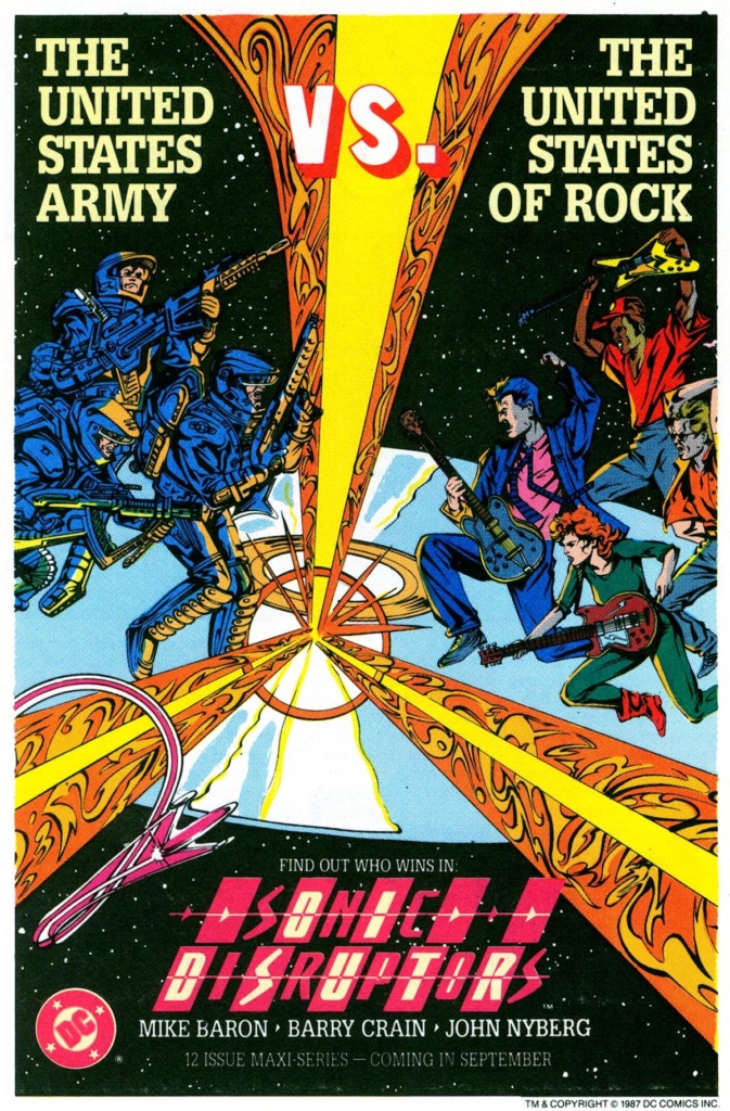
Take, for example, the ad for Sonic Disruptors by Mike Baron and Barry Crain. The series itself was a notorious flop; so bad and incoherent that it was never even finished. Barron said “I didn’t know what I was doing.” Mike Baron apparently spent most of the 1980’s on cocaine, but that one series was a step too far. None of that failure is on the house ad. True, it doesn’t have the immediate grab-your-face style of Salmons or Sienkiewicz (with all due respect to Barry Craine), but that slogan, the post-Love and Rockets rock-pose, the three energy beams shooting at the reader. It makes you ask questions: where are we? When are we? Why is the army fighting rockers? Can these people breathe in space? That the series fails to answer these questions is not the ads faults.
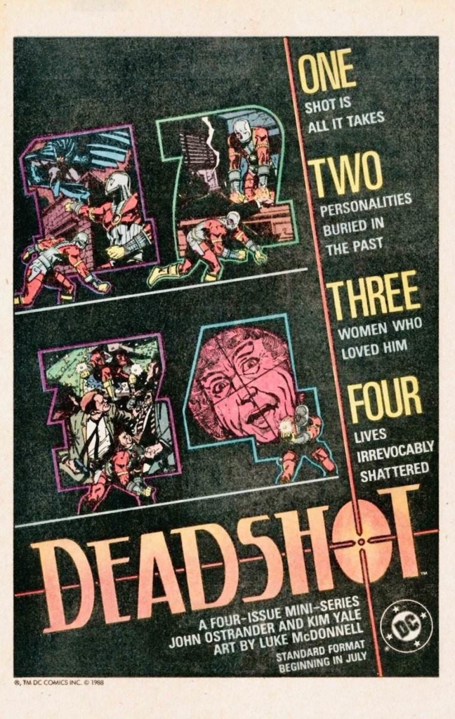
A more successful mini-series from that period (and one that was actually completed) was the four-issue Deadshot. A spin-off from Suicide Squad by the same creative team, it’s another triumph of design, breaking down the image to play on the number issues, telling a story all by itself (with Deadshot sneaking across the page). The decision to put logo in the bottom also pays of, instead of just ingesting it all in one look you are forced to gaze across the page, with the long crosshairs neatly dividing the ad so that separate components, the credits, the series description, the images, never intrude on one another.
Speaking of Suicide Squad, house ads weren’t just made to promote new series but ongoing ones as well. In the days in which the single issue could still be considered a thing by itself, rather a fodder for the eventual collection, you could try and make the readers grasp something they might have not read before. This one is far less visually striking, but the play on the upcoming election is attention grabbing by itself. That the two series protagonists are obviously competing to kill someone, rather the expected one trying to kill and other trying to save, is an added bonus.
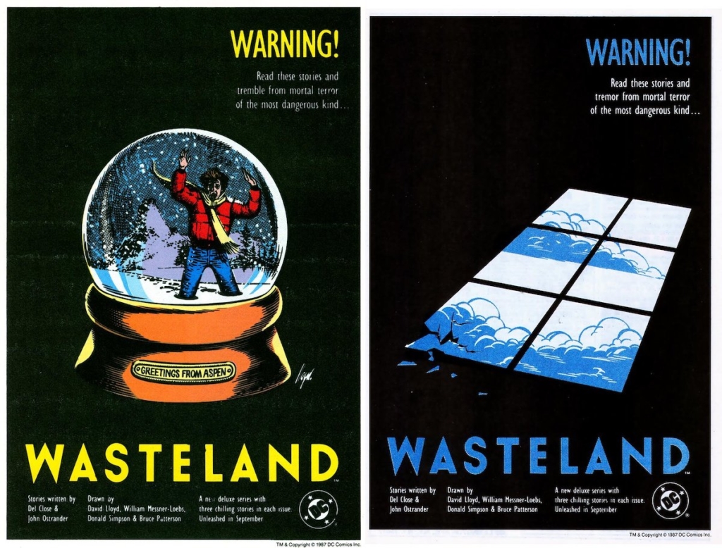
While the usual suspects for DC’s best of the 1980s are the likes of Moore, Morrison and Miller; the actual response might actually be John Ostrande who was also the managing force on horror anthology Wasteland, which had some truly evocative house ads attached to it. Rather than just throwing cool imagery these ads are a model of restraint, with a clear visual theme and their own sense of identity. The ad wasn’t just recycled art from the story, but something unique. Heck, I’d say they were better than most of the Wasteland’s actual covers.
But truly, that was the era of mini and maxi series. The era of the deluxe ‘new format’ and of the baxter paper. Watchmen, itself boosting one of the most impressive house ad campaigns in memory, gave people license to go wild. What the hell is meant to happens on Slash Maraud? What even is a ‘Slash Maraud’?
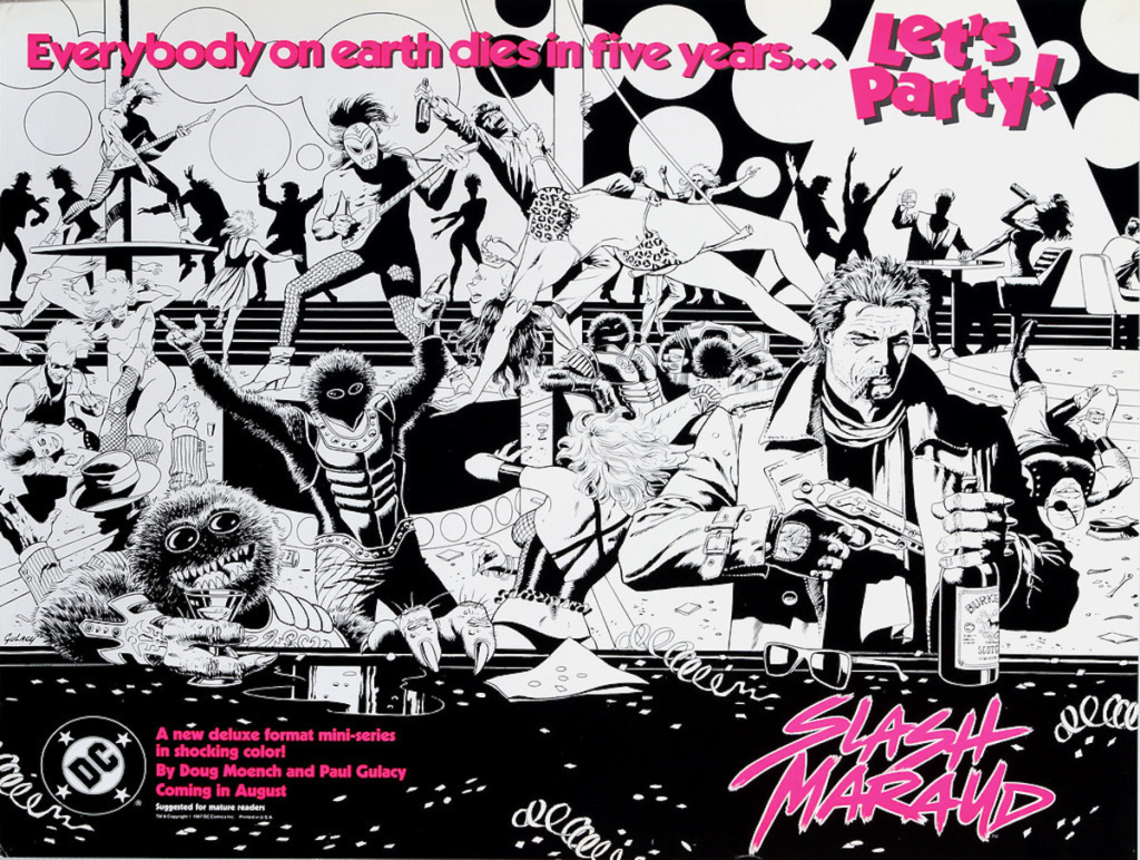
The ad certainly didn’t give you any explanation! It was, as the kids today say, extremely ‘vibes’ heavy instead; all about the mood, the feeling, the sense that something out of the ordinary was going to burst out of the page (I’m cheating a bit and using the full spread art from the promotional poster, most people would probably only see the one page version). Paul Gulacy was always more chic than your average cape artist; his people felt slightly more real, but not in a ‘normal person’ sense. Rather, they felt like movie stars inhabiting their roles.
In the Slash Maraud ad he captures the balance promised in tagline: “Everyone on earth dies in five years… let’s party.” The people on the page move with wild exuberance, but dipped in obvious sorrow. They party to forget what can’t be forgotten. Look at our series lead: a leather jacket, spiky hair, a bottle of booze in one hand, a large gun in the other and a cigar dangling from his mouth. It should be too much, parodically overt, but Gulacy makes it work. Cool assurance and tragedy rolled into one, like something from an early John Woo feature.
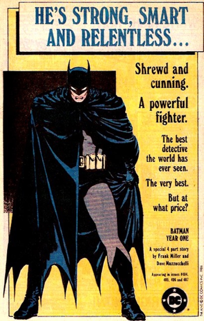
On the other end of the scale is Batman: Year One, a drawing so powerful it really needs nothing else to work. Not the text on the side, not the promise of Frank Miller (then, one of comics hottest talents), not extra images of enemies, or even much scenery. This one ad is all about the power of David Mazzucchelli’s pencils. He draws Batman just standing there, and it’s not the most dramatic pose the dark knight ever struck (he’s not even fully hunched!), and yet it’s like being hit with a ten-ton truck. Watchmen is the high everyone is chasing, but Year One is right after it – so much so that DC’s business plan every year appears to be “how many prestige Batman miniseries can we throw at the audience before they give up?” So far, they haven’t found an answer to this question.
Not that it stopped them from trying. Batman: The Cult, featuring the art of Bernie Wrightson, was as outre as Year One was down-to-earth. One promised to make Batman believable, the other promised to break him. For all the action in the center, what one remembers is the way Wrightson draws the city in the background, building as massive black-hole silhouettes, seemingly absorbing all the light. His background in horror is especially clear.
Everything I’ve written here is only the tip of the iceberg, and that only when relating to a specific period in a specific company in one specific market. There’s more, so much more. I really do wish for a proper book, either by DC themselves or a publisher like Fantagraphics or perhaps Tomorrows, that would curate these ads and would give some proper scholarly background on their creation. Comics, as a culture, is still woefully understudied. Our history is often kept by skilled hobbyist, which is good, but not good enough.
I hope, if nothing else, that you come out of this article with an understanding of why house ads are important and the way they could be works of art in their own way. Like any art that became lost, browsing through current issues I see less and less of them, and what I see is hardly graphically challenging or exciting. We should work harder to preserve it. As the man said: “Those who forget their history are condemned to miss out on the really cool ad for a Mister Miracle series that evokes American Gothic, for some reason, dunno why, but now I want to find out.”
And if the man said such a mouthful, how could you ever refuse him?
