When it comes to the origins of Marvel Comics — at least, the Marvel Comics that audiences recognize today, filled with superheroes like Iron Man, Spider-Man, and Thor — there are certain people that come immediately to mind: Stan Lee and Jack Kirby, of course, but also Steve Ditko, John Buscema, John Romita, and Marie Severin, to name just a handful. Less celebrated, but absolutely integral to the company’s brand, are two names that defined the look of Silver Age Marvel as much as any other: Sam Rosen and Artie Simek.
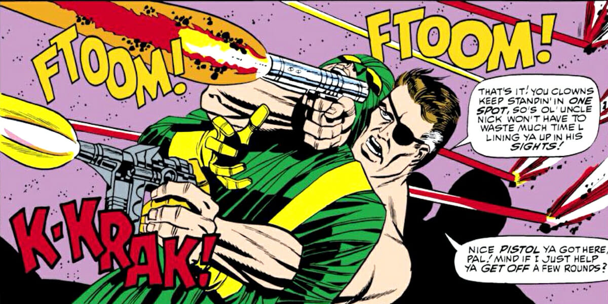
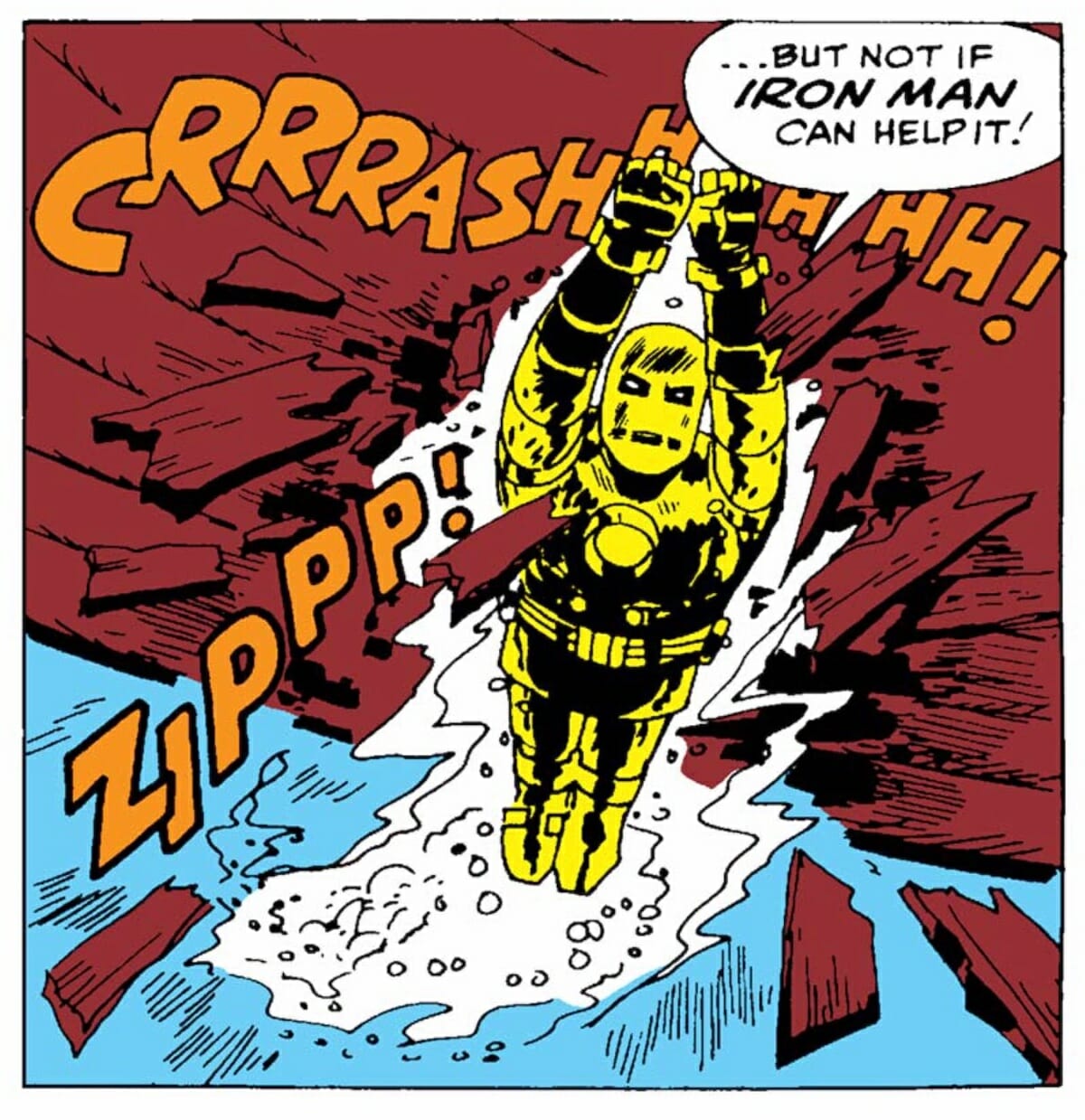
Simek and Rosen weren’t writers aping Stan the Man’s huckster-ish prose style, nor were they artists working in the Kirby and Buscema mold — although they were both arguably following Stan’s eagerness to co-opt aesthetics from other media into comics, and they were also as skilled as artists in their own way as any penciller who worked for the self-declared House of Ideas. Instead, they were the two busiest letterers to work on Marvel’s output through the early ‘70s, setting the tone for what Marvel comics would look like for more than a decade, from word balloons to narrative captions, sound effects and cover logos alike.
While Rosen and Simek were far from Marvel’s only letterers — others, including Rosen’s own brother Joe, were also employed by the publisher at the time — they were by far the most prolific, and between the two of them dominated the lettering scene at Marvel for more than a decade. Each had their own stylistic quirks, but together they defined an aesthetic that to this day still reads as “Early Marvel Comics,” to the point that it’s referenced and ripped off by latter-day designers and letterers aiming to evoke that particular flavor of nostalgia.
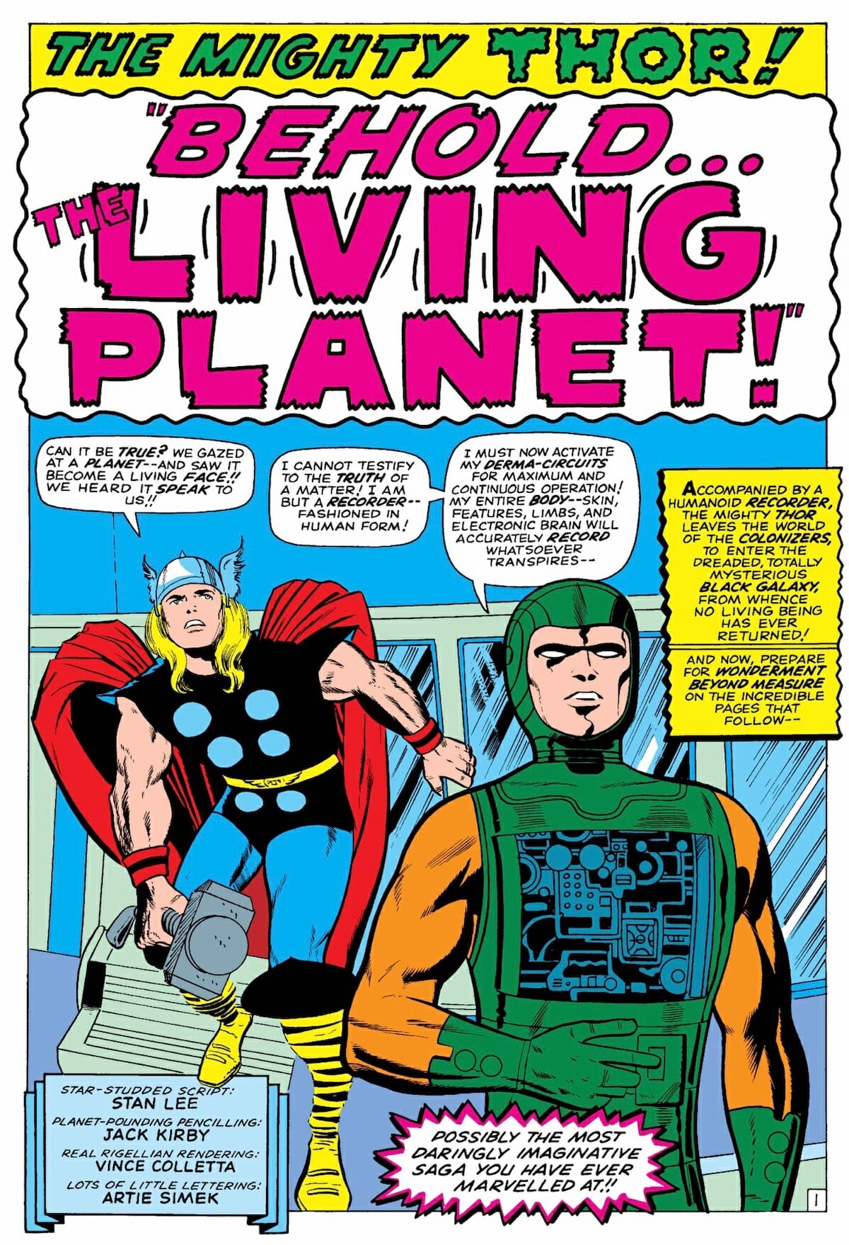
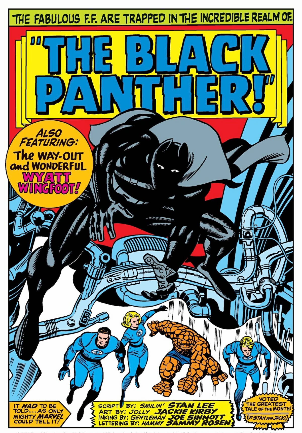
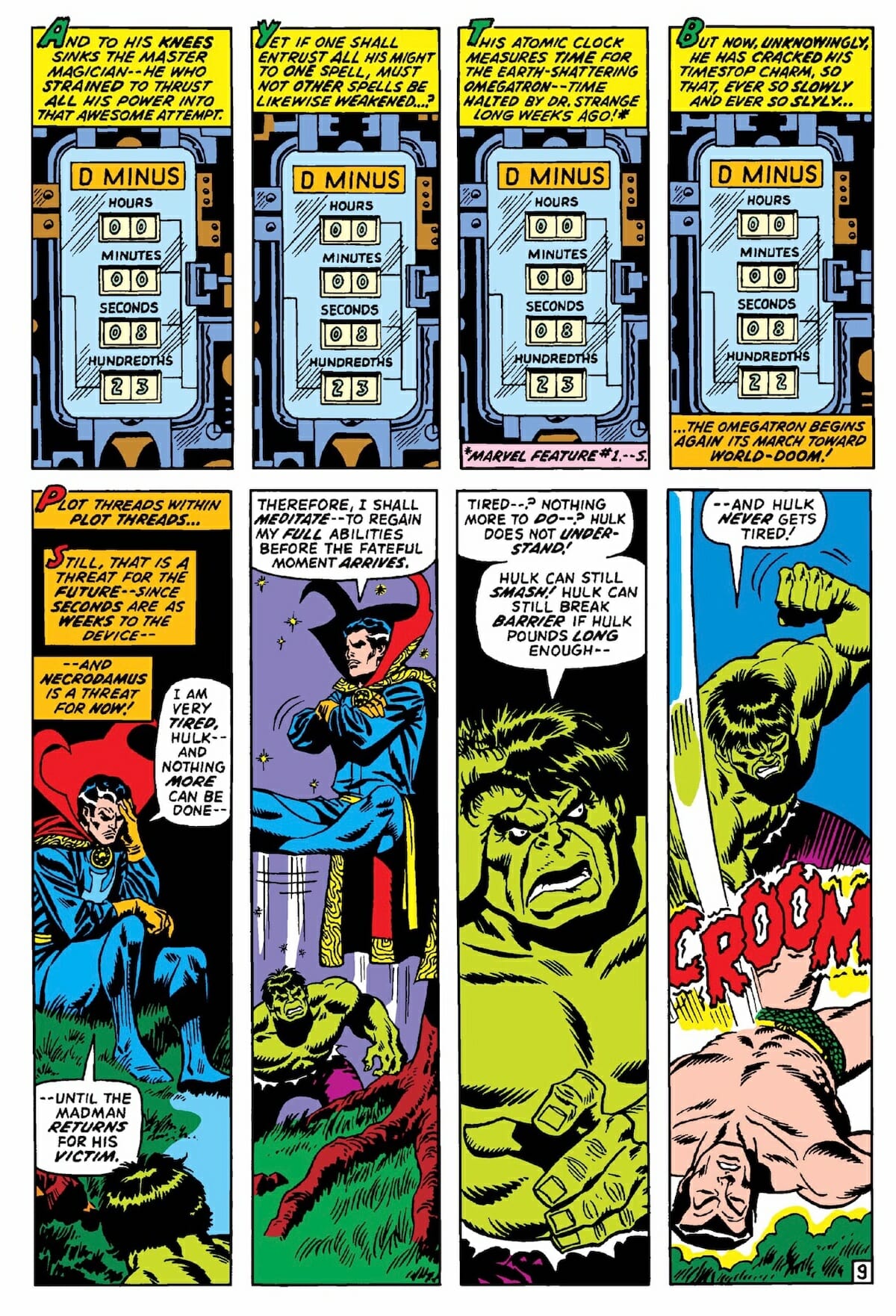
Take, for example, the tendency to use graphic representations of banners as backgrounds for lettering, especially the title for any given story, or, for that matter, Simek’s fondness for using knock out display letters to start caption boxes. Both of those stylistic tricks are, in comics at least, identified particularly strongly as elements of the first decade of so of Marvel’s output, even though both have long graphic design histories in mainstream publishing before Marvel’s very existence. (Remember, Simek and Rosen were appropriating graphic design ideas for comics in the same way that Stan was lifting the self-consciously hip anxiety that made up Marvel’s editorial voice from contemporary mainstream writers.)
Similarly, the original logos for series such as Avengers or Fantastic Four are very much of their time in terms of graphic design trends — look at the letterforms on both! — but, appearing as they do as the identifier for a superhero team rather than the headline on a comedy album or television title card, they gave the books an immediate identity separate from what was the norm at the time: bold, strong upright logos like DC’s Superman, Flash, or Justice League of America that projected confidence, security and forward motion. By contrast, Marvel’s logos felt a little… nervous. Off-kilter. Wrong. In that way, they were the ideal way to advertise the contents inside to new readers at the time — just the name on the front of each comic made it clear that these weren’t the superheroes you were used to.
(A quick aside: the actual extent of Simek’s involvement in early Marvel logo design is disputed, with some crediting Simek solo, and others believing he worked with the company’s then-production manager Sol Brodsky. Whatever the truth, everyone places Simek in the mix — even more importantly, whoever can claim the authorship, the logos are impressive pieces of graphic design that stand out even today.)
Like the vast majority of those present at the origins of Marvel Comics, Simek and Rosen were comic book industry veterans who’d been around the block more than once by the time the first issue of Fantastic Four hit the stands in 1961. Rosen started his career in 1940, working for Will Eisner’s studio producing weekly installment of newspaper strip The Spirit, with Simek following not long after, working on staff at Timely Comics beginning at some indistinct point in the mid-40s. (Complete credits, sadly, don’t exist for all projects that far back.) The two worked at multiple publishers across the next couple of decades, including Fox Comics and DC — Simek’s first actual credit appears in issues of World’s Finest Comics and Batman at the end of 1957 — before both ending up at the company that would become Marvel at the end of the ‘50s.
Once they were at Marvel, their careers were set. Both worked for the publisher almost exclusively — although Rosen also worked at Archie Comics during the ‘60s — until the end of their careers, both of which happened in somewhat unexpected fashions: Simek died part-way through working on 1975’s Giant-Size Defenders #5, while Rosen had a nervous breakdown in the middle of Captain America #156, in 1972 and walked away from comics for good as a result, without finishing the issue. He died only a few decades later.
In both cases, it was a dramatic end to a career that relied almost entirely on their work being seen without ever drawing attention to itself. Good comic book lettering, almost by definition, is something that should be almost invisible to the eye, allowing the penciller, inker, and colorist to take all the credit for what’s on the page. Rosen and Simek did so much to define the look of Marvel Comics, but in such a way that their contributions were almost fated to be ignored for far too long.
In the mid-1960s, Marvel Comics was renamed “Marvel Pop Art Productions.” It was a classic Stan Lee move, in that it was an attempt to gain greater cultural significance through riding the coattails of an already existing trend, but also in that it was dumped after just four months in the face of fan outcry. (“We never realized how many thousands were intensely loyal to the name Marvel Comics!” explained an editorial about rolling the change back.) The irony of the situation was that, viewed from today’s perspective, Marvel’s 1960s output is an example of great pop art — thanks, in no small part, to Artie Simek and Sam Rosen, who continue to do the most for Marvel even decades after their deaths.
