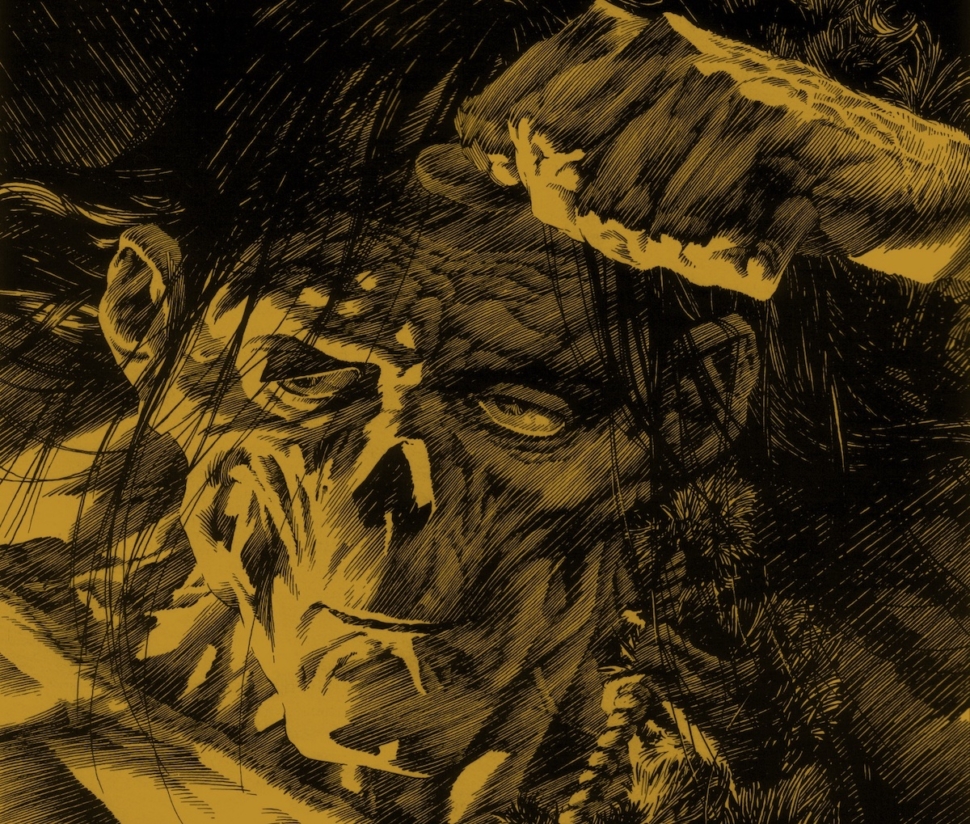
In my early 20s, I visited the grave of Mary Wollstonecraft, but not for wholly feminist reasons. No, I went because it’s where the novelist Mary Shelley (Wollstonecraft’s daughter) and her soon-to-be-husband, the poet Percy Bysshe Shelley, had a lot of secret sex. If you can be a weeb for dead 19th century writers, that’s me. Years after finishing my literature degree, I haven’t shaken the urge to buy copy after copy of Mary Shelley’s masterpiece Frankenstein. Even as that collection grows, there’s one version of Frankenstein I can’t stop coming back to: Bernie Wrightson’s.
This year marks the 40th anniversary of Wrightson’s illustrated edition of Frankenstein, published by Marvel Comics in 1983. Marvel had adapted classic literature ranging from Dracula to The Iliad via its series Marvel Classics Comics, but Wrightson’s Frankenstein was unlike anything they’d ever published. At the time, Wrightson was best known for creating DC’s Swamp Thing with writer Len Wein – not for illustrating. Over seven years, Wrightson created roughly sixty highly-detailed black-and-white illustrations inspired by artists like Gustave Doré and Franklin Booth and designed to look like 19th century engravings. Marvel published roughly 75% (while Apple Comics published the rest as an art book called The Lost Frankenstein Pages in 1993).
Through his dizzyingly complex illustrations, Wrightson invites us to engage with not just the novel’s text but its contexts, bringing to life the artistic and scientific theories that were changing the 19th century as Mary Shelley knew it. When Wrightson died in 2017, he left behind one of the best editions ever published – not just because of Wrightson’s technical skill and the way he brings the novel to life, but because of the passionate obsession that drove him to do it in the first place.
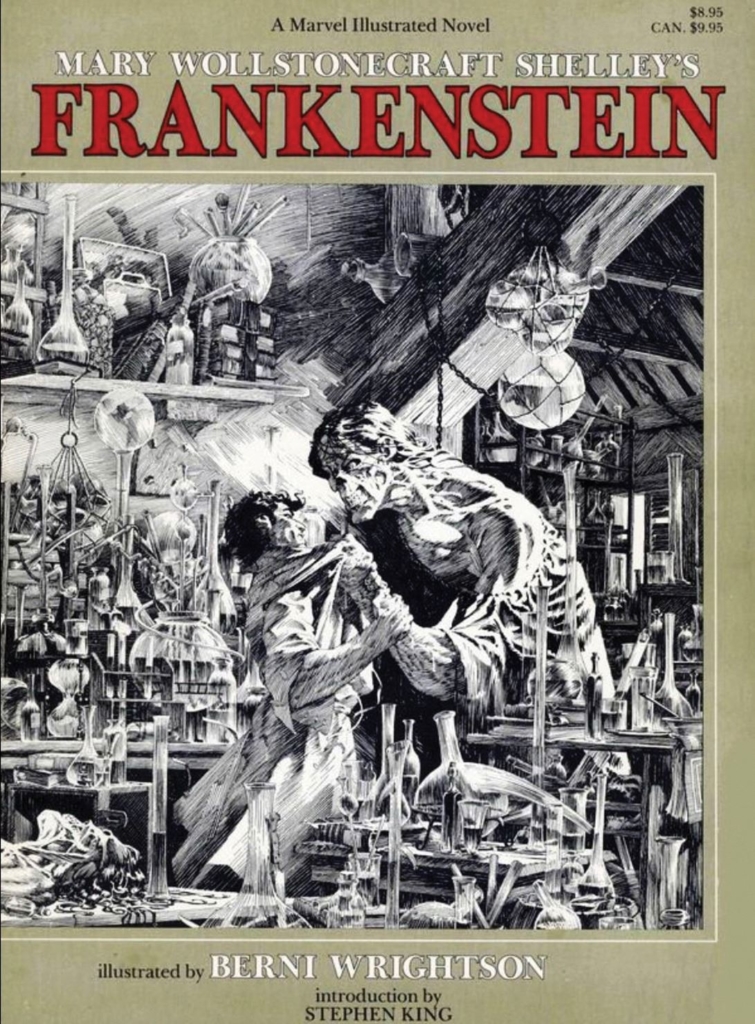
Long before Wrightson, people have been obsessed with the 1818 novel Frankenstein: The Modern Prometheus: the story of an undergraduate student who quits his degree to pursue the world’s weirdest independent study project: building a living person out of human corpses. After being abandoned by his horrified creator, the unnamed Creature teaches himself to speak and read, hoping to overcome the intrinsic revulsion others feel towards him. As he later laments, though, his endeavors are fruitless: “A fatal prejudice clouds [everyone’s] eyes, and where they ought to see a feeling and kind friend, they behold a detestable monster.”
For readers and filmgoers alike, the Creature has become an object of fascination. He’s the consummate Other, interpreted variously as a metaphor for disabled people, queer people, and people of color. (Speaking as a disabled queer person, the way people around the Creature interpret him as monstrous entirely on the basis of his appearance is all too familiar.) While his external difference is read as a mark of his monstrous soul, he only becomes monstrous (killing Victor’s brother, best friend, and bride) after facing continuous ostracism and violence. His real monstrosity reflects society’s own.
While the Creature may be fascinating, he’s difficult to illustrate. The Creature’s fluent speech and desire for compassion make him sympathetic, which illustrations should reflect. Yet, illustrators also have to give visual credence to the revulsion Victor and other people feel towards him.
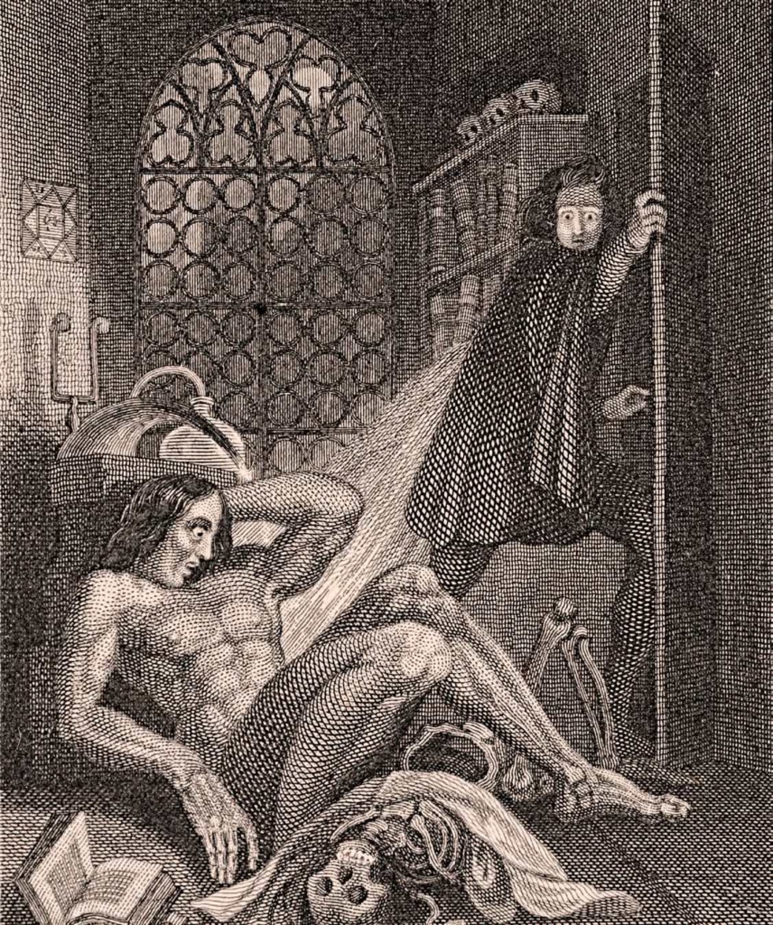
This challenge was evident from the novel’s first illustrated edition in 1831. (This edition, which Marvel used, also featured several major revisions to the text and named the author for the first time.) In one of the book’s two illustrations, Theodor von Holst draws the Creature lying on the floor of Frankenstein’s laboratory, entangled with a skeleton, as a horrified Victor escapes through a door in the background. Though larger than Frankenstein and the skeleton, the Creature’s bewildered expression and subordinate position on the floor stress his innocence and helplessness. Readers might never guess his unnatural origins if his bones weren’t visible through his skin.
The 1931 blockbuster film brought with it a wave of other illustrated editions and every illustrator’s approach to drawing the Creature was different. In 1932, Illustrated Editions published an edition featuring the elaborate etchings of Nino Carbe, who depicts the Creature as a vampiric and racially Othered figure with arched eyebrows, fangs, and a hooked nose. Carbe also took a dash of inspiration from the film, giving the Creature a pair of electrodes in his neck. However, the Creature’s ostensibly sinister appearance in Carbe’s work is contrasted by his frequently helpless, non-violent positions on the page. In one, for example, he simply watches nature wistfully. Heritage Press’ 1934 edition was illustrated by the cartographer Everett Henry, who makes the Creature more terrifying and less sympathetic by never showing his face.
The most widely reproduced edition of the 1930s, published by Harrison Smith and Robert Haas the same year, features a series of over forty haunting woodcuts by Lynd Ward. Combining Art Deco with Expressionism, Ward’s Creature is a naked, powerful – some academics argue queerly erotic – giant emerging from the darkness, barely contained by the page. Graphic novel trailblazer Will Eisner went so far as interpreting Ward’s woodcuts as their own sequential narrative.

None of these interpretations, however, have dominated the collective imagination quite like Boris Karloff. Like many people, Wrightson was introduced to Frankenstein by James Whale’s 1931 film adaptation and Boris Karloff’s now iconic portrayal of the Monster. (In the novel, he’s usually called “the creature,” but 1931 film credits use “Monster.”) In the decades following the film’s release, Karloff’s Monster has shown up everywhere from family sitcoms to Fortnite. His square skull, stitched-together skin, and neck electrodes have become the reigning visual interpretation of Shelley’s creation.
For Bernie Wrightson, that just wasn’t good enough. When he first read Mary Shelley’s novel, Wrightson was surprised – as I think a great many readers are – to learn that Shelley’s original Creature was nothing like the lumbering, groaning figure he’d seen on screen. Unlike the film, the original novel describes the Creature as having watery yellow eyes, “lustrous black” hair, black lips, and shriveled “yellow skin scarcely cover[ing] the work of muscles and arteries beneath.” Shelley’s description – and the lack of accurate depictions of it – gripped Wrightson’s imagination and refused to let go.
Wrightson was haunted by the Creature for decades. In his twenties, his contributions to fanzines included the Creature in comedic comics, a pinup, and an impressive poster of Karloff’s Monster. When he started making comics professionally, the Creature followed. After creating Swamp Thing with Len Wein, they introduced the Patchwork Man in Swamp Thing #3: a man whose body was haphazardly sewn together following a minefield explosion. While Swamp Thing’s design foreshadows Wrightson’s later designs of the Creature, Patchwork Man’s square skull and visible stitch-marks give him a pronounced resemblance to Karloff’s Monster. The issue, written by Wein, further plays up the parallels to Whale’s film when the pair are cornered by a torch-wielding mob. Like Shelley’s Creature (and real-life marginalized folks), Swamp Thing and Patchwork Man are denied humanity and community by a society that only sees them as monsters.
However, all of these Creatures were Karloff knock-offs. Wrightson still wanted to draw the real deal: a Creature that accurately reflected Shelley’s novel. In 1975’s “The Muck Monster,” a short comic published in Eerie #68, Wrightson foreshadowed the greater work he’d soon create in Frankenstein. Telling the story of a scientist and his monstrous creation, “The Muck Monster” features a simplified version of the cross-hatched line work Wrightson would later use for Frankenstein and was similarly intended to be black-and-white. Perhaps most striking are the designs of the Muck Monster and scientist: the scientist has the same high cheekbones and unruly dark hair as Wrightson’s Victor, while the Muck Monster has the Creature’s giant figure, skull-like visage, black hair, and melancholy eyes. Wrightson’s final design for the Creature – often depicted in intimate close-up – strikes a perfect balance between humanity, viscerality, and the grotesque.
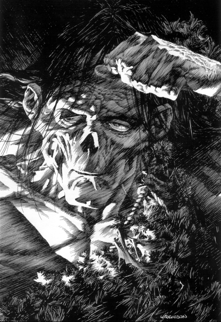
Having found his Creature, Wrightson began the lengthy process of illustrating Frankenstein later that year. Though he’d read a comic book adaptation of Frankenstein published by Classics Illustrated, Wrightson wanted more: a fully illustrated version of Frankenstein from the early 19th century. Since that didn’t exist, he decided to do it himself. As he later told comic book writer Steve Niles, “[it] was my first real attempt to completely serve the story and the author’s intentions, and I found it challenging as hell!” And while Wrightson’s illustrations are designed to serve the author’s intentions, they can also be read – as a narrative of their own, as Eisner read Lynd Ward.
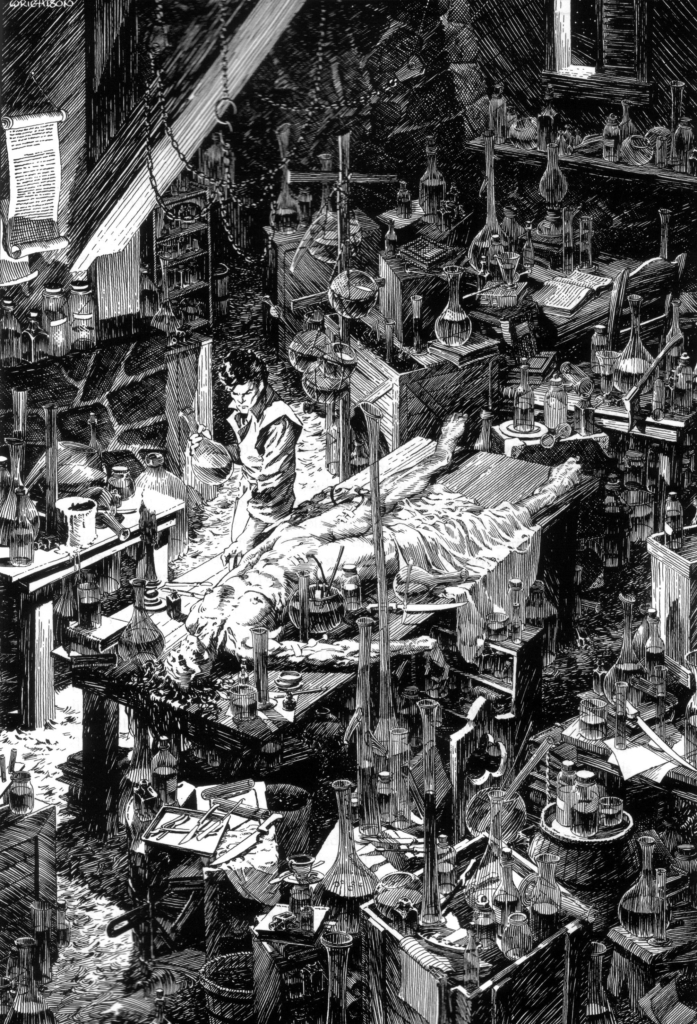
Working in pen and ink, he drew a series of sophisticated and highly detailed black-and-white illustrations using the dense, cross-hatched linework traditionally associated with engraving. Wrightson’s compositions are meticulously constructed, never leaving a single beaker or blade of grass to the imagination. They can be oppressive in their detail, but Wrightson invisibly guides us (placing subjects of each image by placing them on the rule of thirds, making them much brighter or darker than their surroundings, and creating lines that invisibly point us towards them), making sure we’re never lost.
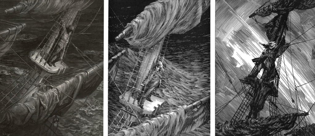
By creating something that feels 200 years old, Wrightson also invites us to engage with the novel’s ideas and contexts in a more profound way. Both Victor’s and the Creature’s stories are framed by the story of a ship captain named Robert Walton, who has gone in search of a tropical paradise past the North Pole but stranded his ship and crew in the process. Wrightson’s illustration of Walton, showing him clinging to the rigging at the top of his ship’s mast during a storm, draws us to its subject with the intersecting lines of the mast and a beam of light. X marks the spot.
More than that, however, it directly engages with the art and ideas of the Romantic period. Rather than illustrating Shelley’s text, Wrightson visually quotes a similar illustration for Coleridge’s poem “Rime of the Ancient Mariner” by Gustave Doré. (Wrightson’s preliminary drawing verges on forgery.) In the opening letters to his sister, Walton jokingly compares himself – as Wrightson’s artwork does – to Coleridge’s doomed Mariner, but assures her “I shall kill no albatross, therefore do not be alarmed for my safety.” In Coleridge’s poem, the Mariner shoots a lucky albatross, leading to the death of his crew. Although Walton assures his sister he’s nothing like the Mariner, the illustration teasingly says “I wouldn’t be so sure if I were you.”
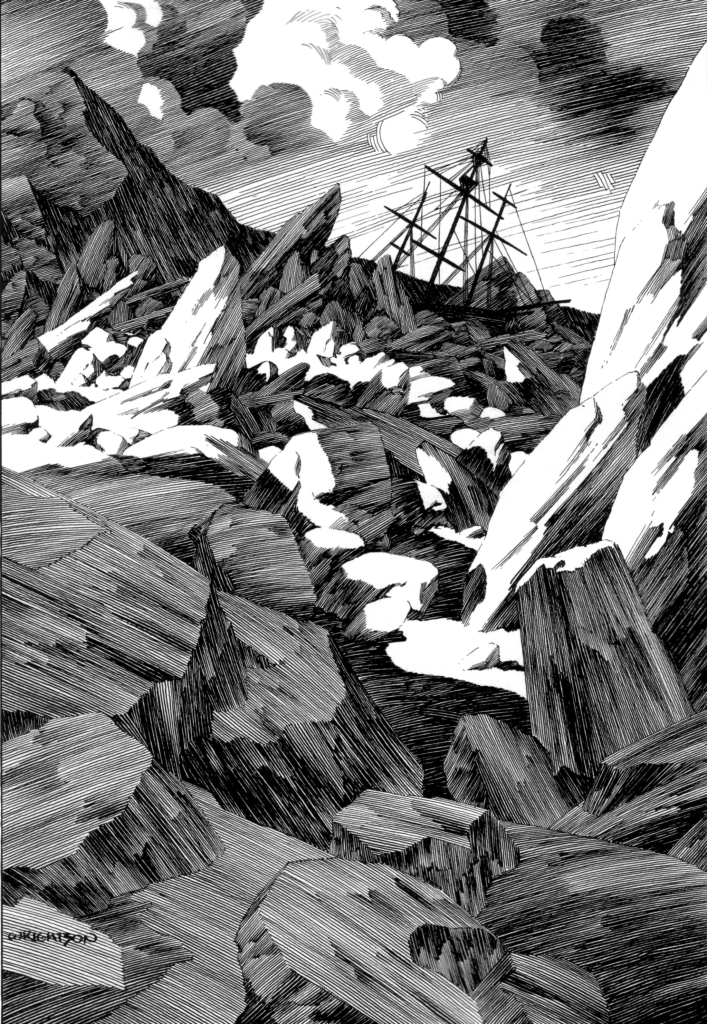
Walton’s journey culminates when his ship is trapped by “mountains of ice,” with a dying Frankenstein giving him a pep talk about striving for greatness while the crew begs him to turn back. Wrightson’s illustration of the wrecked ship, which appears in dark miniature, drawing our eyes between the massive shards of ice, invokes an idea central to both Frankenstein and 19th century art: the sublime.
“Sublime” isn’t a word used much in the modern day, unless someone’s talking about a glass of wine or a velvety chocolate mousse. The sublime, in an aesthetic context, is something very different: sublime subjects in art or nature serve to inspire awe and make us feel small. The philosopher Edmund Burke argued that its power isn’t from beauty but Terror. In sublime paintings, miniature figures contrast the might of the mountains or sea, while tombs, ruins, and dying trees emphasize our transience and insignificance. Frequently, fog reminds us of all we don’t – and will never – know.

In the modern age, we might attach the sublime to high-definition photos of space, but for people in Mary Shelley’s time, nowhere felt more terrifyingly transient than the North Pole. Around Frankenstein’s release, doomed Arctic expeditions like Walton’s gripped the public imagination. Wrightson’s depiction of Walton’s ship trapped by “mountains of ice” evokes artworks The Sea of Ice by Caspar David Friedrich and The Icebergs by Frederic Edwin Church, though it guides our eyes to Walton’s wreck, rather than putting it in the periphery. These paintings reminded their viewers that, in Victor Frankenstein’s words, “a fervent longing to penetrate the secrets of nature” often ended in tragedy. For both Frankenstein and Walton, mastery over nature is a futile exercise. Nature always wins.
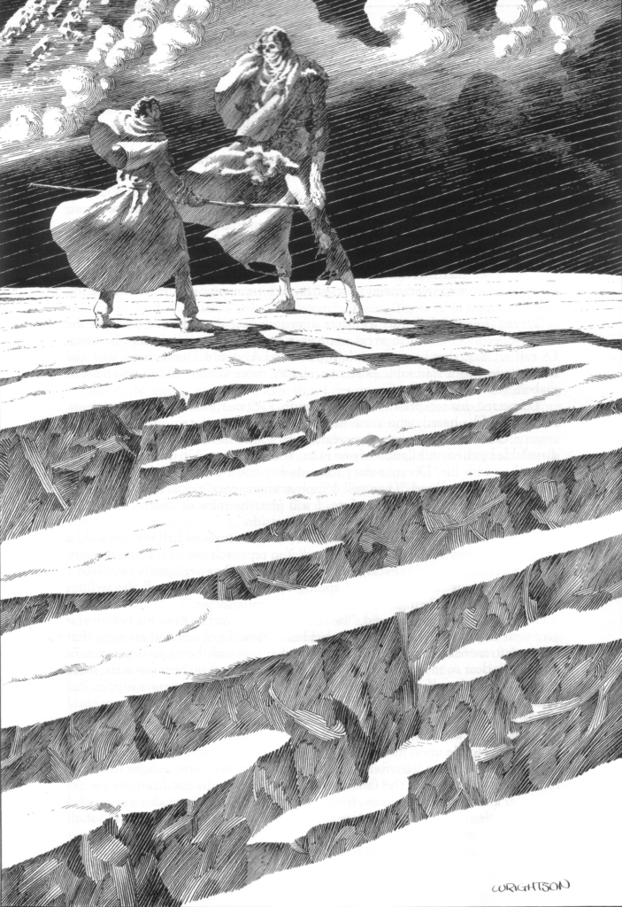
After the Creature murders his brother, Victor takes a hike in the Alps to clear his head, hoping to focus on “the magnificence, the eternity of such scenes, to forget myself and my ephemeral, because human, sorrows.” However, he finds the Creature instead. Wrightson depicts this moment as a disruption of the sublime aesthetic. Neither miniscule nor faceless, Victor and his creation stand face to face on the mountain top with nothing to distract us from their confrontation. The impact of his actions and suffering he has caused carries not only narrative but visual weight. Victor isn’t allowed to “lose himself” in the Alps and neither are we.
For the most part, figures in Wrightson’s compositions are alone, stressing the novel’s focus on the relationships between society and the individual. Several illustrations feel intimately close with the Creature. Pages become dominated by his longing, mournful gaze. Wedged between rocks or crammed into a shed as he watches a peasant family through a hole in the wall, the Creature is visually placed outside of society but simultaneously confined because of it.
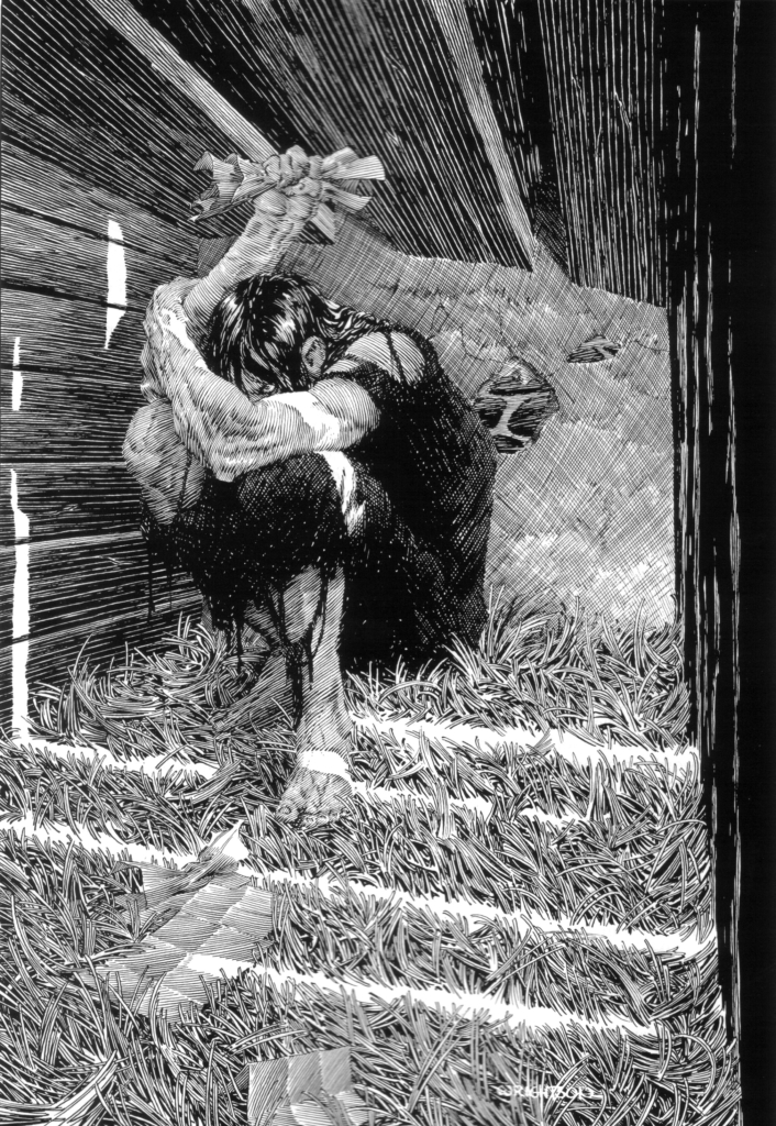
Unlike the Creature, spurned for his appearance, Victor and Walton are children of the Enlightenment, swearing off society in the name of scientific advancement. Inspired by the Romantic period’s preoccupation with creative genius, they go it alone. Like Frankenstein’s subtitle, The Modern Prometheus, implies, their choices to strive beyond their means after technological advancement lead to their ruin.
In Wrightson’s illustrations, Victor’s scientific obsession and self-destructive ambition are reflected in his environment. As the scholar Kate Newell has observed, “[scientific] apparatus is not limited to Victor’s laboratory but enters the frame in every scene involving science or experimentation. As Victor deteriorates, the apparatus becomes increasingly oppressive, almost camouflaging the characters in the scene in which the Creature confronts Victor for destroying his mate.” In addition to Walton and Frankenstein, Wrightson’s illustrations of the Creature show him carrying firewood or lighting fire multiple times, strengthening his associations with fire and suggesting he, too, is Promethean. He, too, strives beyond his means and is doomed to fail.
However, Frankenstein is more than a parable against scientific advancement and the perils of playing God. The turn of the 19th century was defined by rapid scientific progress and rugged individualism but also by rampant inequality and raging colonialism. Christa Knellwolf asserts that the novel really reminds its readership “that the process of expanding geographic and intellectual boundaries needs to be embedded in a context of care, responsibility, and respect.”
Shelley had learned firsthand the damage done by the Romantic myth of the individual. As the legend of Frankenstein’s creation goes, nineteen-year-old Mary Shelley invented science fiction on one stormy night at Villa Diodati as part of a ghost story competition. (A lot of media acts as if her life stopped with Frankenstein, but she went on to preserve Percy Bysshe Shelley’s legacy after he died, write several books including an absolute banger of a plague apocalypse novel called The Last Man, and help a queer couple get forged documents so they could flee to France.) Some of the context that gets left out is why Mary was at Villa Diodati in the first place: her half-sister Claire was pregnant by the celebrity poet Lord Byron, who had self-exiled to Switzerland after being ostracized from polite society for being bisexual (and his disability – like the Creature’s physique – appeared to confirm this so-called moral corruption). After meeting Byron, it became obvious that he wasn’t interested in fatherhood. Or Claire. The Romantic myth of the individual was everywhere, often hurting people or simply erasing them. In a less extreme case, William Wordsworth wrote about “wandering lonely as a cloud” while his sister Dorothy was walking alongside him.
The Romantic myth of the individual was selfish nonsense, and in Frankenstein, Shelley let everyone know. In his pursuit to understand electricity and gain mastery over human life, Victor cuts himself off from others to create the Creature, then refuses to fulfill a parental role for the Creature, all leading to his destruction. Walton, likewise, abandons society and risks the lives of his crew to search for Paradise. To put all of this another way: progress, creation, and scientific advancement mean nothing without compassion and community. Then again, maybe Wrightson’s final Frankenstein illustration, of the Creature standing alone on an ice floe “borne away by the waves and lost in darkness and distance” says as much all on its own.
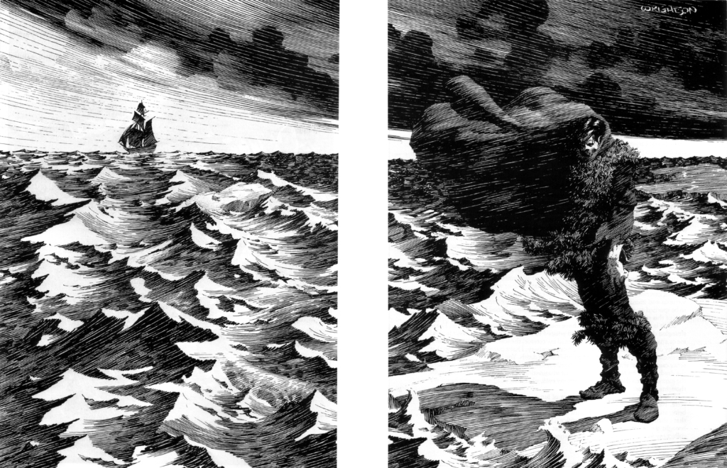
Like Shelley’s Creature, Bernie Wrightson’s Frankenstein has outlived him in more ways than one. It has been republished twice: once by Dark Horse in 2008 and again by Simon & Schuster in 2020. Wrightson returned to Frankenstein in 2012 alongside writer Steve Niles via IDW’s comic miniseries Frankenstein: Alive, Alive!, which picks up after the events of Frankenstein and finds the Creature working at a sideshow after failing to take his own life at the North Pole.
Using the same character designs as Wrightson’s illustrated Frankenstein, production on the four-part miniseries was slow due to the artist’s complex style and worsening health. As the miniseries was finishing completion, the artist realized he wouldn’t live to see Alive, Alive! finished. Knowing the end was near, Wrightson asked comic artist Kelley Jones (best known for his horror-infused Batman work) to complete the final issue. He passed away from brain cancer in 2017, but his masterwork lives on, bringing Mary Shelley’s words to life for years to come.
What continues to make Wrightson’s Frankenstein so potent all these years later is the passion and time he poured into it. In the modern age, love is often considered cringe. Telling your friends you love them is cringe. Loudly loving comics or anime or Frankenstein? Even more cringe. It’s easy to limit Wrightson to his technical skill and forget why he did what he did in the first place. Wrightson, like Frankenstein (and a great many of us real people), was driven by obsession, curiosity, and a desire to create. But unlike Victor cutting himself off from the world, Wrightson’s work is a vital reminder that if you pour your passion into something and share what you love, chances are high someone else will love it too.
