Comic book movies are something that audiences have become more than familiar with over the past decade, as Marvel, Warner Bros. and other studios have delved deeper and deeper into back issue bins for inspiration for the next multi-million dollar franchise to exploit for fun and profit. Between the countless CGI action sequences, big names, big titles, and longer run times in lists of the most successful movies in recent years, there’s hardly a person on the planet that can deny the popularity of American comic books in the film industry. For all that those special effects and sassy one-liners from a cardigan-clad Hulk do it for some, however, I’m here to argue that the best comic book movie isn’t even based on a comic at all — but that, through color use alone, 2015’s Mad Max: Fury Road may be the greatest example of comic book aesthetics seen in contemporary filmmaking.
Like many movies released in the past few decades, Fury Road is a post-apocalyptic action film. Indeed, the original Mad Max trilogy of movies made decades earlier — Mad Max in 1979, Mad Max 2 (AKA The Road Warrior in international release) in 1981, and 1985’s Mad Max Beyond Thunderdome, all directed by Fury Road director George Miller — was as much inspiration to the generations of filmmakers responsible for many of those movies. In this most recent iteration, Max Rockatansky (Tom Hardy) — a former police officer turned wasteland drifter, played by Tom Hardy — gets snatched by the bloated Immorten Joe (Hugh Keays-Byrne), a dictator of sorts who controls the water supply in the desert, beginning an epic reimagination of the road movie genre that, after Max’s escape, sees the hero sitting side-saddle in a story about redemption and strength.
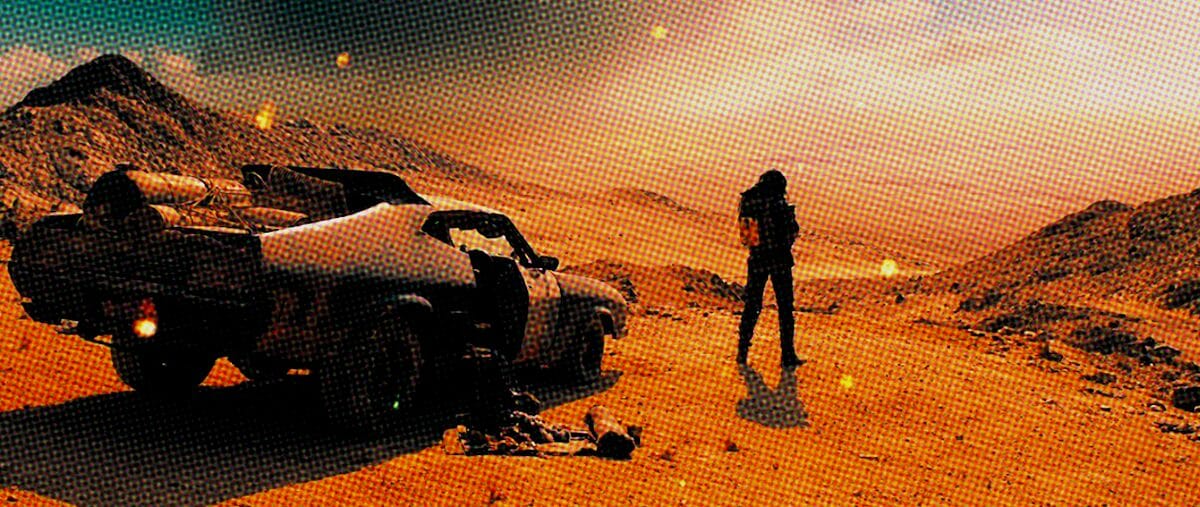
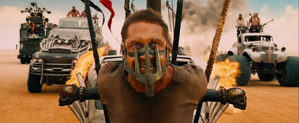
Much has been written about the ways in which Fury Road is more visually impressive than other action movies in the years surrounding it. There are uncountable moments of this film that are not only spectacular, but truly, breathtakingly beautiful; in part because of a dedication to center framing, practical stunts, rapid-cuts (that manage to not be entirely disorienting for a change), and the additional of texture/grit to portion of the frames, all of which has been the subject of significant discussion in the years since the movie’s release. And while all of those things play into why the film has reached such a high caliber of acclaim, what I’m here to talk about is the color grading treatment throughout the film, which created an extremely rich color palette on screen — one that was not only richer than real life, but more specifically, the delightfully garish palette of comic book artwork.
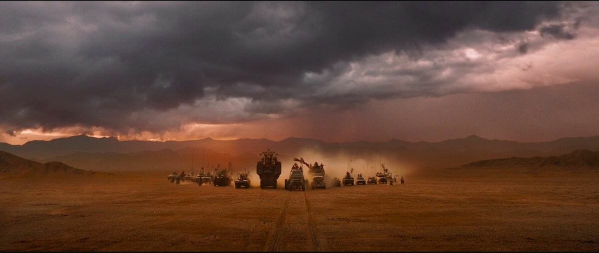
It can be easily argued that the orange and cyan color palette combo is something that has been utilized by the film industry to absolute death in recent years — simply look at almost any other movie set in a generic post-apocalyptic setting from the past twenty years or so. When society has fallen, the logic seems to run, everything starts to look like mud. (To be fair, it’s not an entirely misguided theory.)
The difference with Fury Road, however, is the filmmakers’ willingness (eagerness, even) to not only use the colors not just as a fun filter for an otherwise bleak, monochromatic dullard of a desert setting, but to lead the eyes where they need to go. With Miller displaying a consistent focus on characters’ eyes, faces, and the emotional context of their actions, often demonstrated not through dialogue but through movement and the actors’ physicality, the movie’s use of increased color contrast not only provides a direct line from viewer to largely unspoken plot, but offers a strong link to the storytelling of cheaply printed, limited-palate comics of Britain in the 1970s and 80s— comics that were, notably, both created by people working on Fury Road, and widely distributed in Miller’s native Australia, and therefore likely to have been present in the wider cultural context in which Miller was working and taking inspiration.
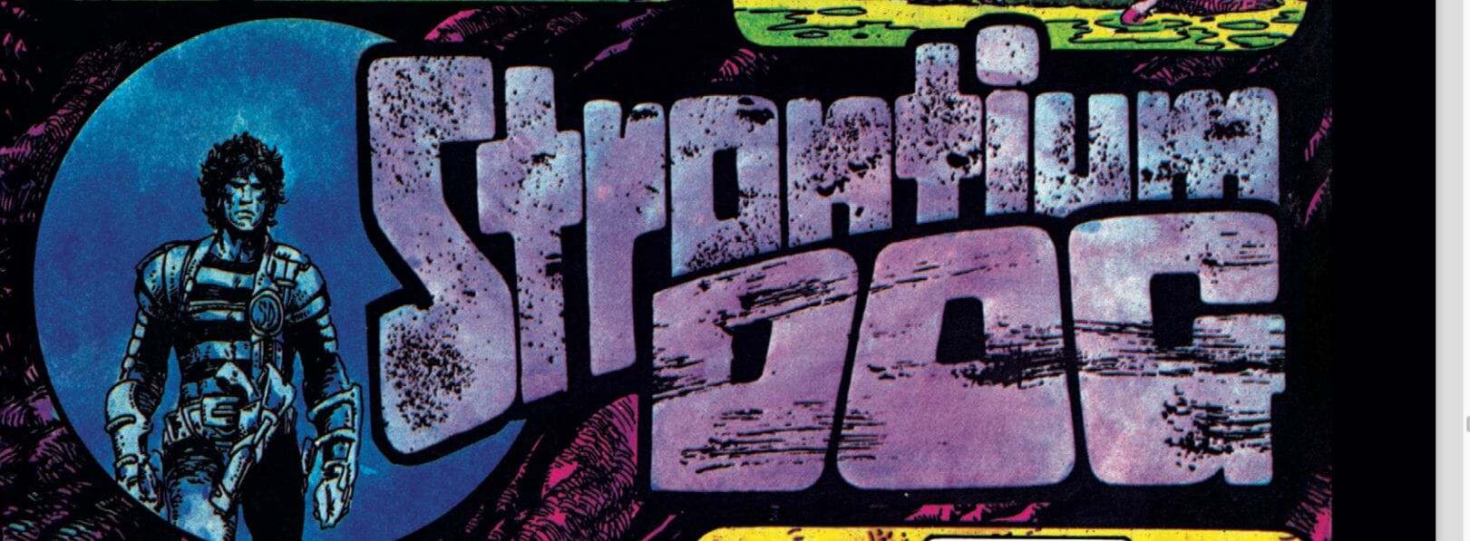
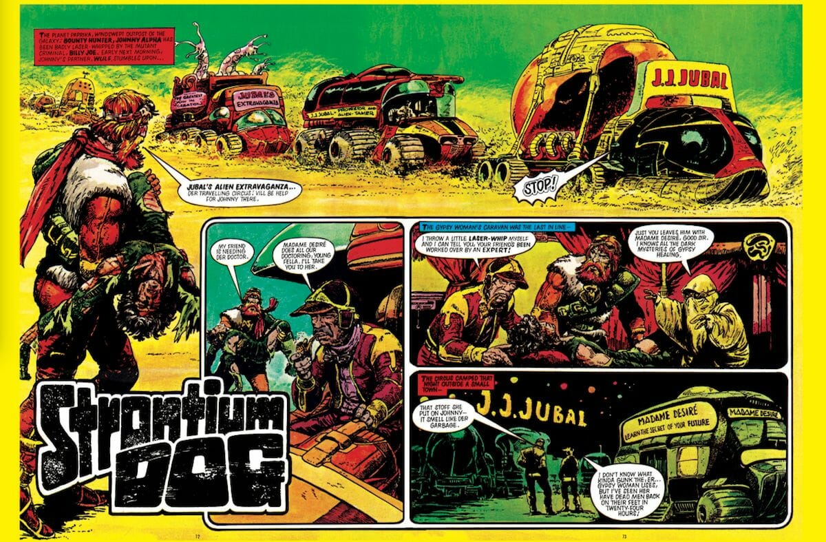
Comics of the 1970s were not exactly high on the priority list for many printers, and therefore were relegated to using newsprint, meaning that final pages would come out with highly saturated, high-contrast blacks and almost obscenely rich, flat colors on the rare occasions that such comics would get to use a few pages of color. For this reason, comics like 2000 AD, The Beano, Action, and Battle Picture Library —each one a mainstay of U.K. newsagents and the collective comics landscape of British children throughout the 1970s — ended up looking mighty similar to the intense monochromatic look of the specially-decolored release Fury Road: Black and Chrome, while the crudely-reproduced two pages or so of color artwork in each issue had the impact and drama repeated multiple times in multiple scenes by Miller and crew’s color choices on Fury Road.
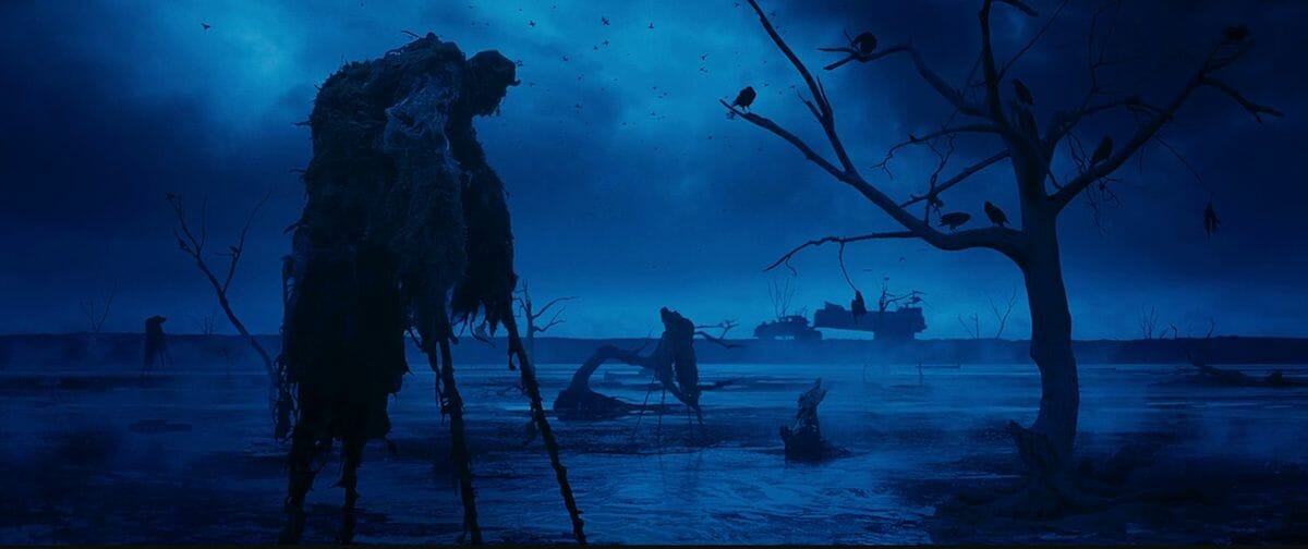
It’s not merely that Miller chooses an overly-bold color palette, of course; it’s his use of color throughout the movie. Fury Road by design denies realism and naturalism in its visuals — a bit of irony considering how many of the effects are practical and shot in-camera. The color choices through the movie follow this rejection of how the real world works, with highly contrasting (often, clashing) colors placed next to each other to ensure that the viewer is paying attention to exactly what Miller wants them to. It’s the same logic that comic books fans from the 1930s through the 1990s had grown up with, except there it was born of necessity; with an extremely limited number of colors and shades available, not to mention a printing process that could strip detail out of an artist’s line work, there was no alternative but to throw strong purples and oranges into the same panel to ensure that certain elements popped the way they were supposed to, especially if they would prove to be central to the larger narrative. (This same trick can be used for “nighttime” artwork — using blues and purples as a “day for night” layover to overexposed brightness in place of an overly-darkened image — and is similarly used to provide evening and night scenes throughout Fury Road.)
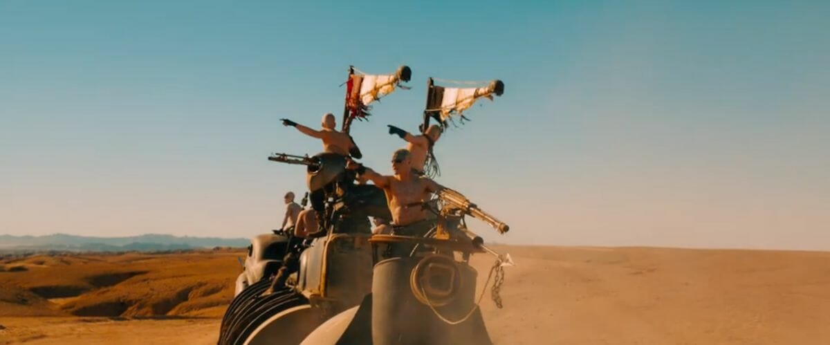
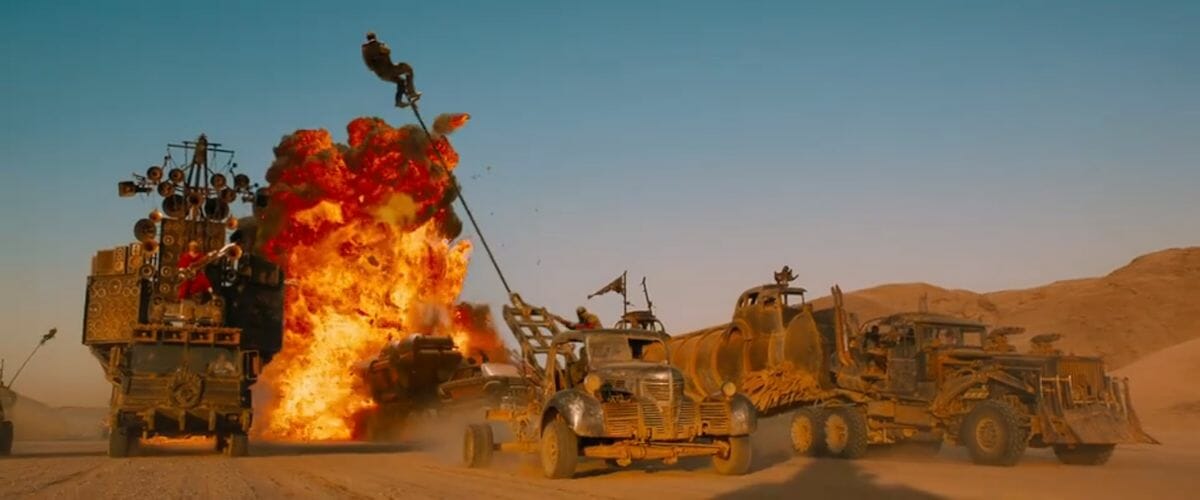
In time, this necessity became an aesthetic that outlasted the limited printing process that created it, and it’s that aesthetic that Miller taps into time and time again in Fury Road. Compare splash page spreads of 1980s episodes of Judge Dredd — usually colored by the deft and deeply underrated Tom Frame — to the action sequences in Fury Road, and look at the ways in which color is used as a signifier as to intent; to draw the audience’s attention to the latest thrilling sequence. As the oversized trucks complete with flaming guitar soundtracks with “war boys” reduced to pale white skin with inkblot make-up for features rampage across the screen — almost silhouetted by the shockingly blue sky behind them —the only missing element that feels as if it could make things even better is the sight of Joe Dredd on his Lawmaster motorcycle flying into the air, firing his Lawgiver and declaring to anyone within earshot that he is the law, even in the Cursed Earth. Whether by accident of on purpose — considering 2000 AD artist Brendan McCarthy’s designer and co-writing role in making the film —Fury Road is a few extra word balloons away from being a brainchild of Wagner, Mills, Ezquerra, and McCarthy circa 1982.
For the most part, however, the film speaks for itself in all of these things, and I don’t want to labor the point any more than I already have. The cheaply produced comics of the ‘70s and ‘80s, and Mad Max: Fury Road, are, after all, intentionally visceral experiences that feel almost aggressively placed to push back on over-analysis, demanding instead that you simply sit back and surrender to the thrill power being thrown in your face. That said, it would be a loss not to appreciate Fury Road as a series of exquisite, beautifully trashy, visual moments, in addition to enjoying the film as the breathless, unstoppable race across the screen that it’s already known and loved as; there’s an artistry to be acknowledged in the composition, the contrast, and the unapologetically bold color choices in almost every single shot of the movie. While it’s always fun to sit down and have a rewatch, there’s a depth and nostalgia for comics to be found that comes from appreciating the film as a series of panels, pages, or even double page title spreads from some of the greatest comics that never actually happened.
