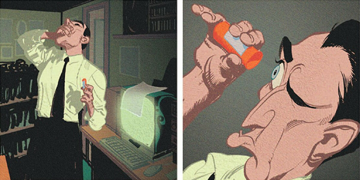
You can always tell a Kyle Baker comic. It’s something about the faces – overtly expressive, always telling more through bulging eyes, furrowed brows, or puckered lips than through words. Or maybe it’s something about his bodies – forever twisted in movement; limbs flailing wildly, muscles tense, bodies turning at seemingly impossible angles. It’s something about the action, so over-the-top it becomes a gag even when it’s not meant as a gag (The Shadow pulling a bazooka in the middle of a street fight, as if it’s the most normal thing in the world). It’s something about the stories as a whole, where his heroes are often weirdos, losers, and assholes; people who always seem to destroy themselves as they destroy others.
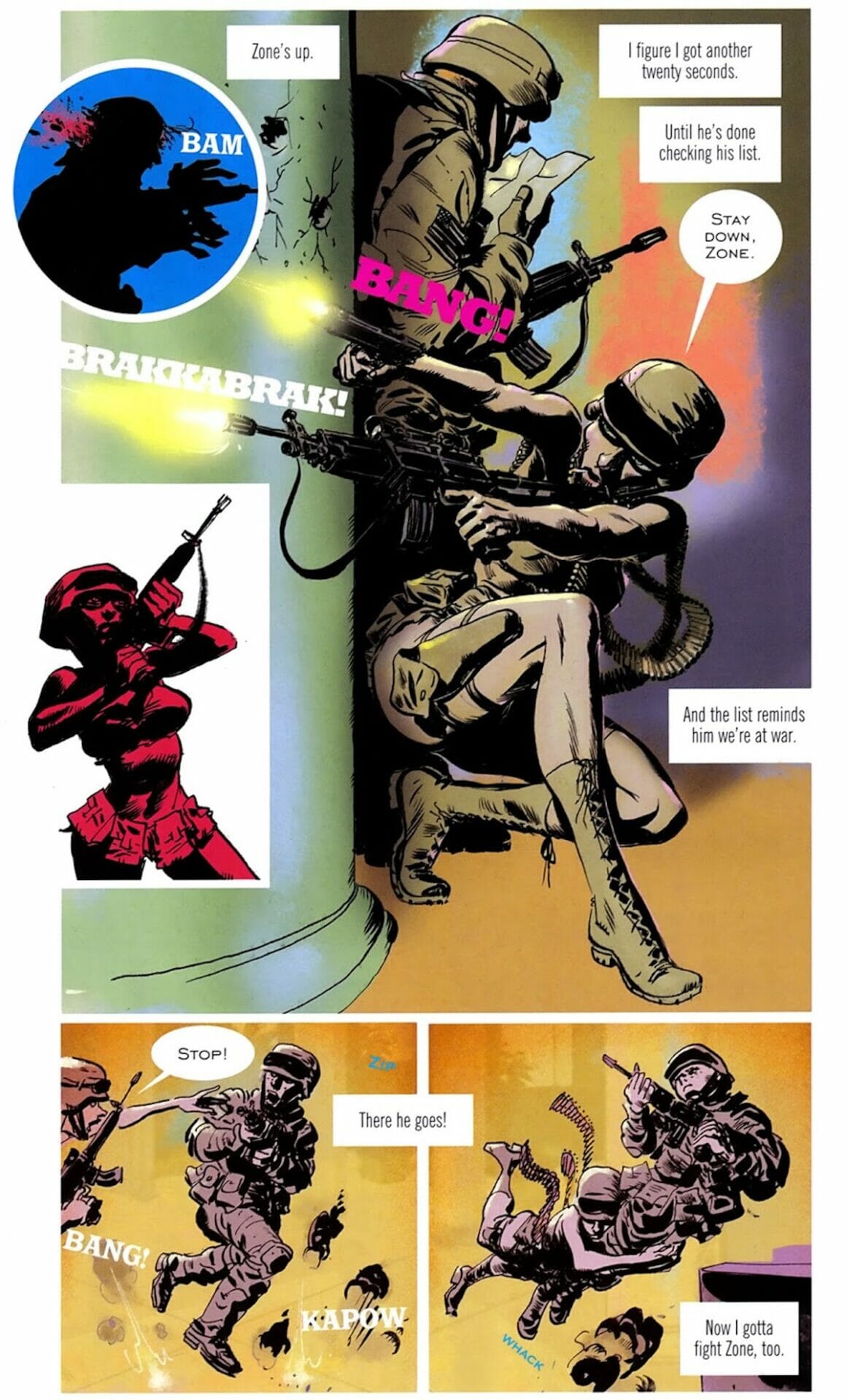
For reasons that I could continue to list, you can always tell a Kyle Baker comic. Whether it’s the brutal action of Special Forces, the understated character drama of The Cowboy Wally Show, the Looney Tunes-esque wild swings of I Die at Midnight, the Neal Adams parody towards the end of Plastic Man, the near-classical cartoon composition of King David… all so all so obviously coming from the same pen.
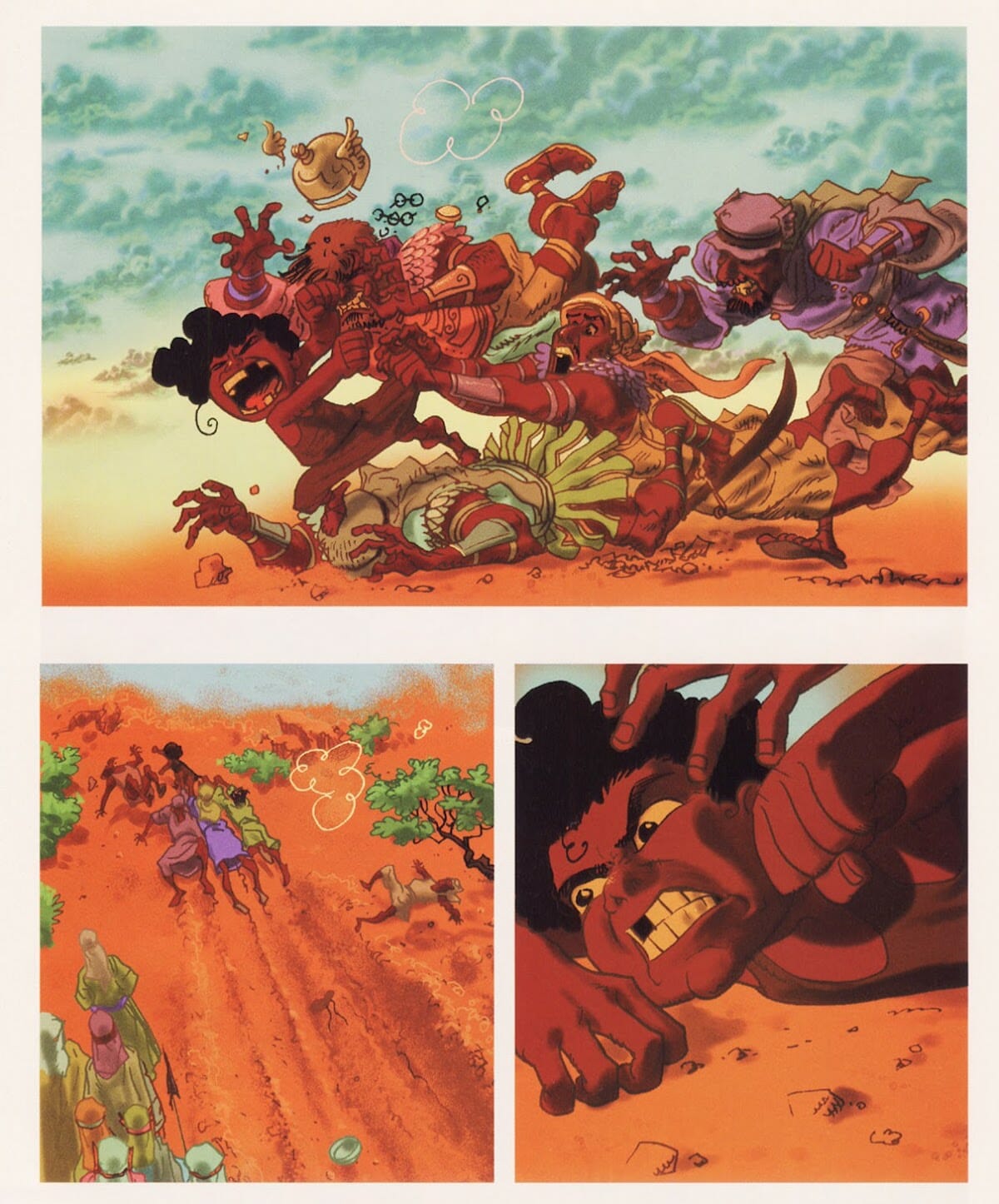
Despite the remarkable ability to tell a Kyle Baker comic, this one-man-brand is something contrastly odd for what he does. Baker was, and is, one of the more versatile artists in the industry –a dab hand as both a penciler and an inker and a colorist who is easily adaptable at drawing others’ scripts as he does his own (though when Kyle Baker draws a story it almost always finds itself transformed into a ‘Kyle Baker comics’).
One of his earliest works was penciling The Shadow for DC, and you’d think it’d be a horrible tonal clash. After all, he’s an artist known today mostly for comedy; he has nothing to look for in that world of pulp violence, but in saying that you’d be wrong.
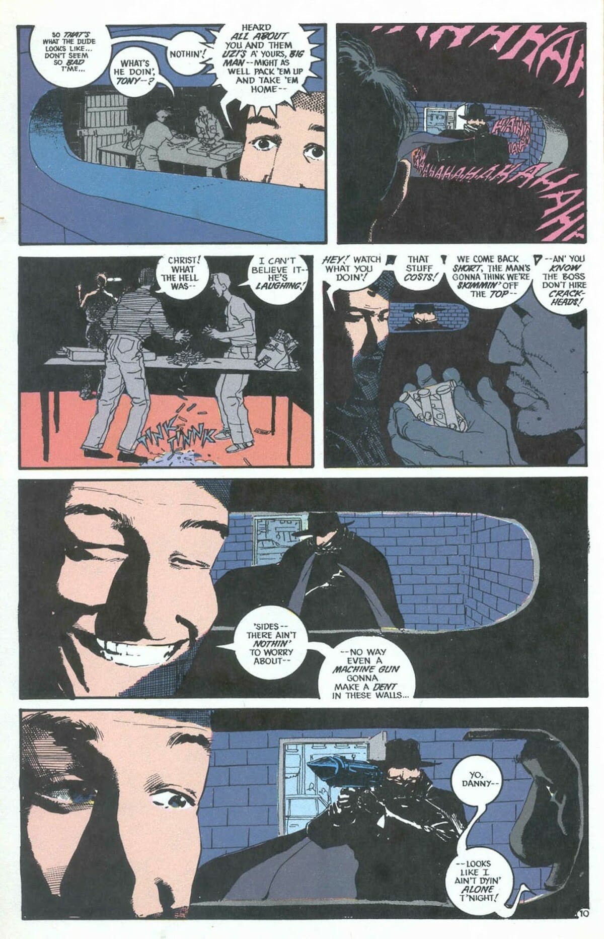
Following Bill Sienkiewicz in his run on The Shadow, Baker shows that he’s got a great flair for the melodramatic and macabre while keeping true to the tone set before him; adding a certain slyness to the faces and body language. You can see his presence, feel the artist he would become, in the eyes of the Shadow’s would-be victims – pulsating with fear, almost popping out of their sockets. The Shadow himself seems to be toying with his victims, like Batman with a dark sense of humor, wringing joy out of the suffering of his criminal victims – his movements like those of a cat playing with mice.
His work on the spin-off, sadly uncollected, Justice Inc. is also worthy of mention. Another revamp of a classic pulp character, the Avenger, it follows on the artistic hills of a different Sienkiewicz project, Elektra: Assassin.
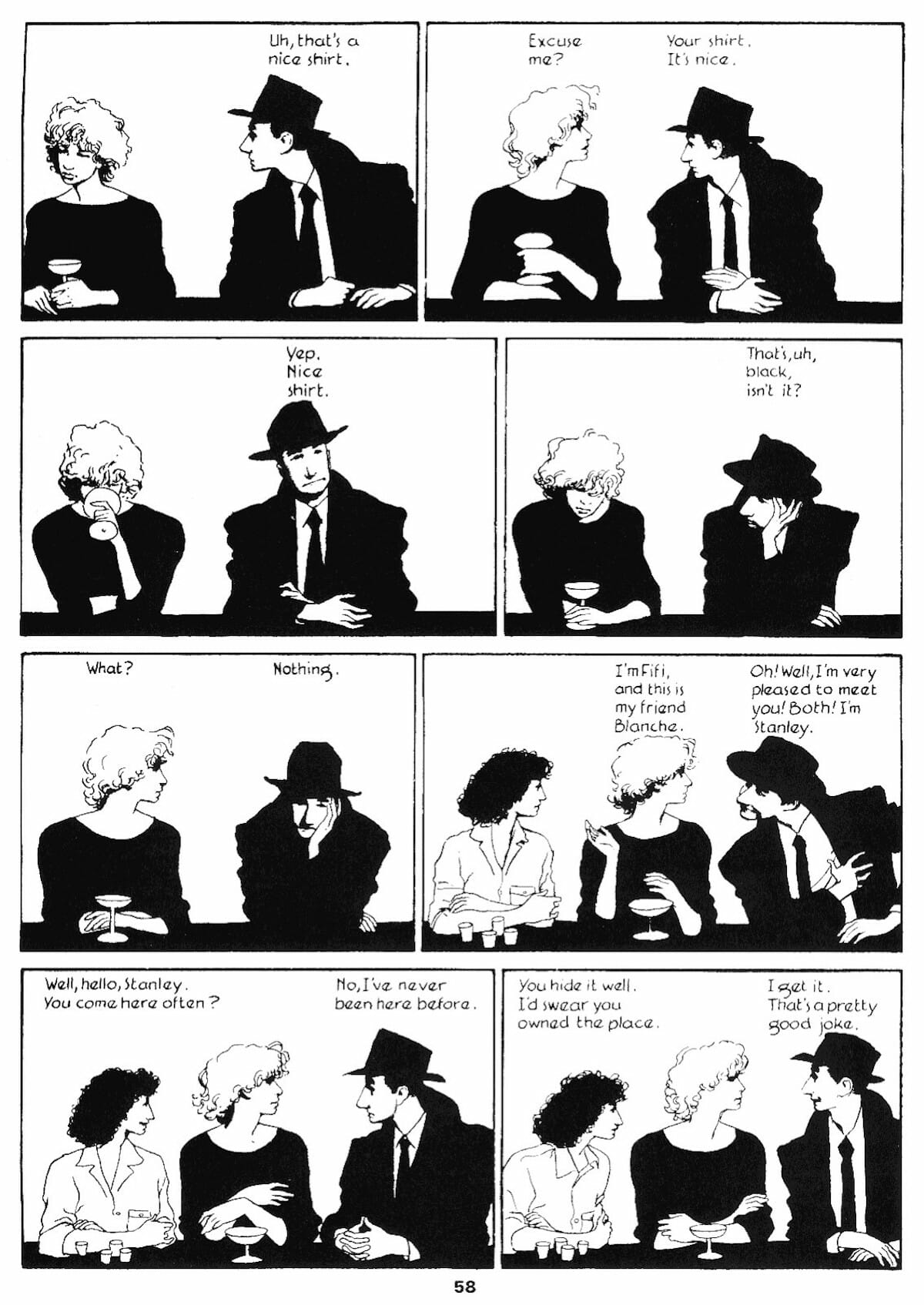
Justice Inc is a twisting, grimy, story about American internationalism in the 1980’s. The story still has humor to it, but it is of understated sort, more wit than slapstick. The Avenger’s gimmick utilizes Baker’s gift for special expression: He is a man whose face is like clay, capable of being molded. Baker uses that trait to great effect, showing him as a frozen-faced killer, someone who can become other people because his interiority has become hallowed by his handlers. The story is about a robot-of-a man fighting back, clawing his stolen humanity by force.
That the two series could come at roughly the same time, from the same creative team utilizing the same pulp roots, and still look and feel so utterly different – shows the variability that Baker was capable of. That was early on in his career, when he was still finding his feet, already showing what he would become.
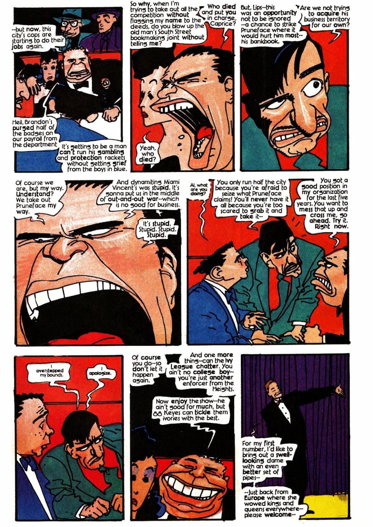
Several years later Baker would utilize the same cartoon-noir look in Dick Tracy – a three issue series meant to coincide with the Warren Beatty film. That series is not only far better than it has any right to be, a film adaptation produced by Disney, back when their comics division was almost nonexistent; but I’d go one to say it’s one of the finest-looking American comics of the 1990’s. Every single figure and background in the comics just POP – it’s a city of mugs and dames, with noses that poke your eyes out and foreheads like mountains. People in that series don’t just walk – they run and slouch and hop-to-it. Every page is this rich tapestry of movement and sheer being, streets crowded with an oddball cast, projecting character just through visual flair.
Impossibly juggling loyalty to the source material, the likeness of the actors and preserving Baker’s own style. When Beatty kept complaining the cartoony style was making him look bad Baker improvised by using T-Shirt artwork that gave that character an oddly realistic and ‘frozen’ look. It really shouldn’t work, but it somehow makes sense in the world of Dick Tracy – the single straightman in a world gone mad.
Baker was showing himself to be an artist who had no trouble adjusting with the times, moving seamlessly from the analogue to the digital age, quickly realizing the potential offered by computer-drawn comics:
“By the ’90s, we were using the kind of high-quality printing and paper that magazine and book publishers used. We could finally reproduce paintings and pastels and photos. So it seems silly to me that we were still using an art style designed for a cheap lithographic process that was no longer in use.”
Lots of creators (and companies) in the 90s struggled with how to properly utilize these technologies. Early computer coloring is often ugly to look at, but Baker understood exactly how to use the new machinery to his advantage: it allows him to experiment in all sorts of different ways, without ever losing sight of himself.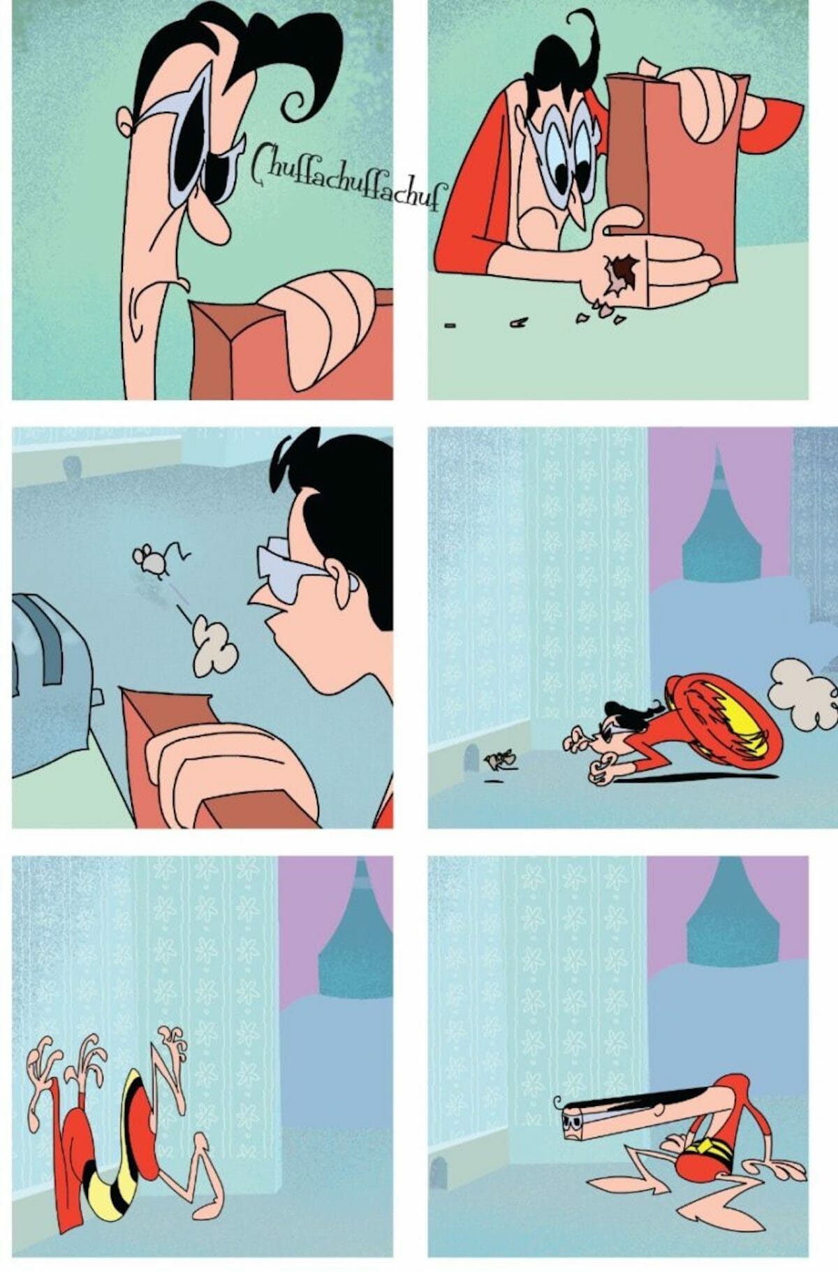

And yes, that experimentation can sometimes cause wild swings in the final quality of the work. His run on Plastic Man contains some truly brilliant moments – I’ll always go for the bat for the one issue that does an extended Looney tunes bit with Plastic Man chasing a mouse around the house – alongside some issues that just look odd and out of place. The reason that these particular issues don’t work visually, however, isn’t because Baker wasn’t trying hard enough, but because he was trying too hard; stretching himself (not a pun…okay maybe a little bit) throughout the series with trying out new techniques and ideas. If some fail… well, it’s an interesting failure – which is arguably better than a boring success when it comes to comics. (And besides, it’s not often that anything Baker touches could be considered a failure.)
As the man himself says – a Baker project is a Baker project:
“My books are published exactly as I’ve written and drawn them. Nobody tells me what to write or how the books should look.”
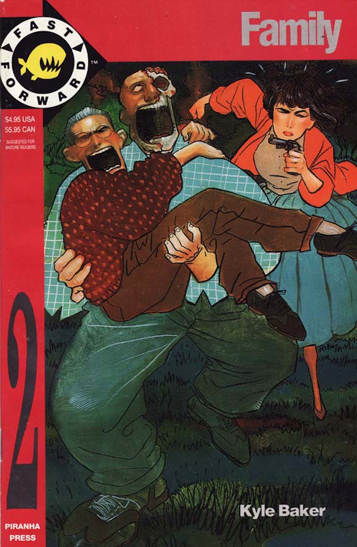
This sentiment allows him to effortlessly move from something lighthearted and fun as The Bakers – which is basically a sitcom in comics form – to a work as bold and harsh (both in terms of writing and visuals) as Nat Turner.
Looking at Nat Turner (which you should’ve already committed that book to memory, but I’m giving you a pass), each page feels like it could’ve come straight from the golden age of illustration, as if Sickles himself had drawn them. That image of Turner talking with the other slaves is such a perfect distillation of a moment – the way the light hits the ground at perfect contrast with the shadow on the tree, the hat just lying around near the feet of one of the characters, a hint to the passion of the debate that must have occurred.
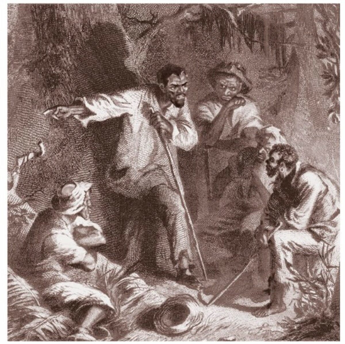
While most of that graphic novel is ‘silent’ images accompanied by text taken directly from Turner’s own words, it is a wordless moment that speaks plenty solely with the power of images alone. Not only that, but it does so without being presented as ‘growing up’ or ‘changing direction’ or any of the other names we give to an artist straying from what we conceive of as their lane. Perhaps that’s because, realistically, Baker didn’t really have a lane. Hee would go on to do more self-published comedy pieces, the exaggerated war on terror satire Special Forces, and even a Deadpool series in which the merc with the mouth would dress up as ninja Rabbi to cut up neo Nazis.
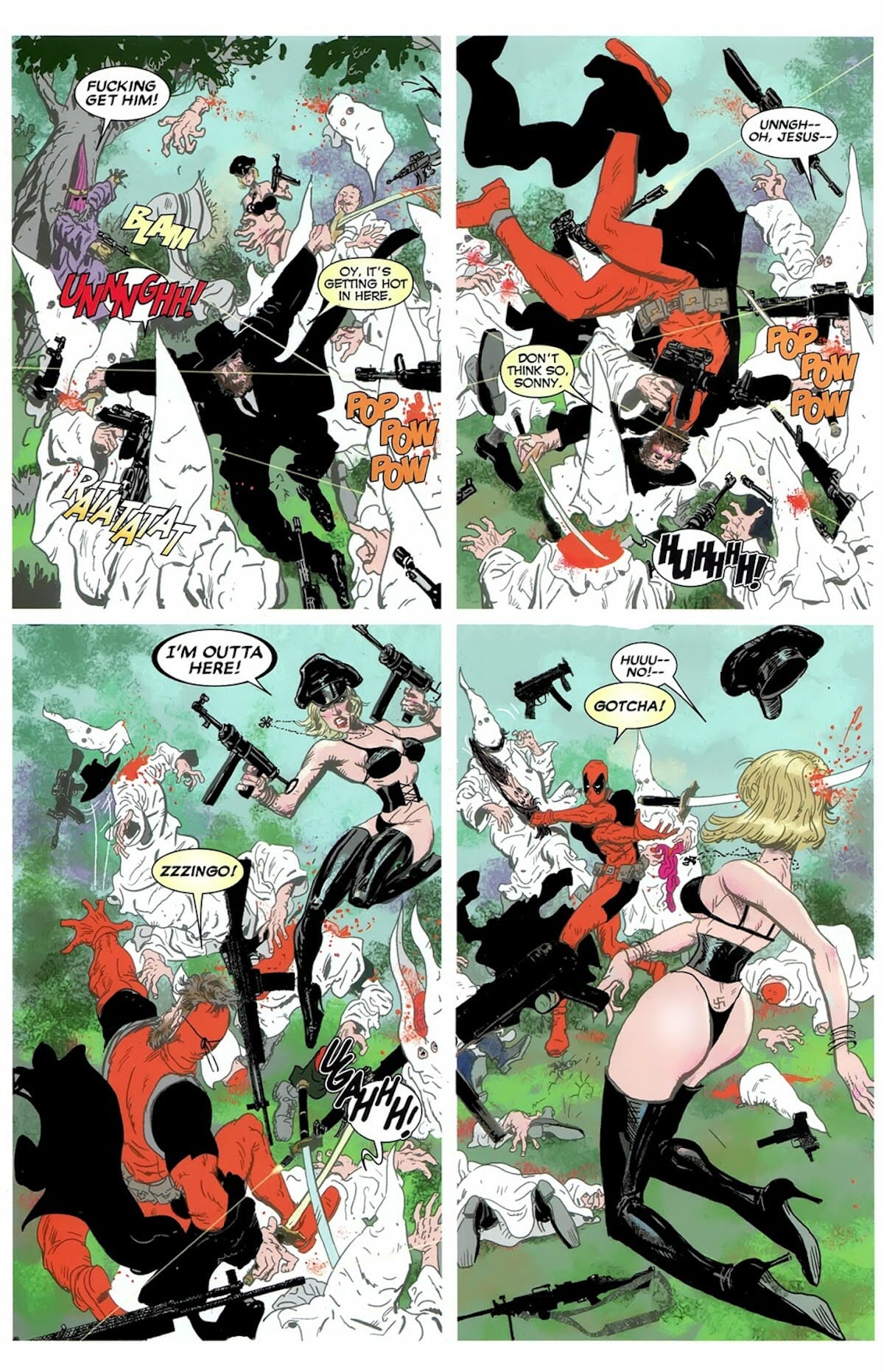
That Baker could do it all and remain identifiably ‘Baker,’ not losing a step from what made him the artist of superhero comics, creator of cartoons for kids and adult comedy strips, is a testimony to his power as a creator. The Auteur Theory no longer holds sway in critical spaces, and rightly so, even something as small as comic is still (often) a team effort. With that being said,if you want to see an example of an auteur in action in the notoriously fickle and mercurial American market, one that is constantly chasing trends and seeks to wring out every single penny from a popular artist before tossing them aside for the hip new thing, you should look at and up to Kyle Baker.
After over three decades in this world he’s still going strong and he’s still identifiable. You can, after all, always tell a Kyle Baker comic.
